App Teardown - Hinge is Gunning for Bumble (and it's Getting Close)
Welcome to App Teardowns, a series where we analyze the strategies apps and games use to gain visibility and downloads on the App Store and Google Play, their performance, and competition.
Dating apps, like Zoom, have become a necessity in the last year for many who didn't want to put meeting new people on pause. Although Tinder and Bumble are the two names that come to mind when thinking about dating apps, there's another that's been holding steady at #3 for quite a while.
That's Hinge, which has seen its revenue grow by 2.5x since lockdowns began, and is the app we'll be analyzing in this App Teardown.
Overall, Hinge earns an A-, because things are almost good.
In this guide:
- Hinge by the Numbers
- Look at That Mountain!
- Hinge vs. the Competition
- How is Hinge Found?
- Keyword Analysis - The Obvious Parts
- What's in the Keyword List?
- Screenshot & Video Analysis
- What Data is Hinge Collecting?
- A Quick Look Under the Hood
- The Verdict: Show Me the Money
- The Tools I Use
Hinge by the Numbers
Here's how Hinge is performing in the U.S. App Store, based on our Competitor Intelligence:
- 📈 274.5K estimated downloads in the last 30 days.
- 💰 $5.9M estimated revenue in the last 30 days.
- #️⃣ 12 in the Lifestyle category.
- ⭐️ 85.3% of new ratings were positive in the last 30 days.
- 👋 Audience is young and leans male.
- 🏅 Competitors include Tinder, Bumble, Plenty of Fish, OkCupid, Coffee Meets Bagel, and those are only the name you'd recognize...
Look at That Mountain!
I mentioned revenue a few times already, and that's because Hinge is making more of it. Let's have a look at our estimates:
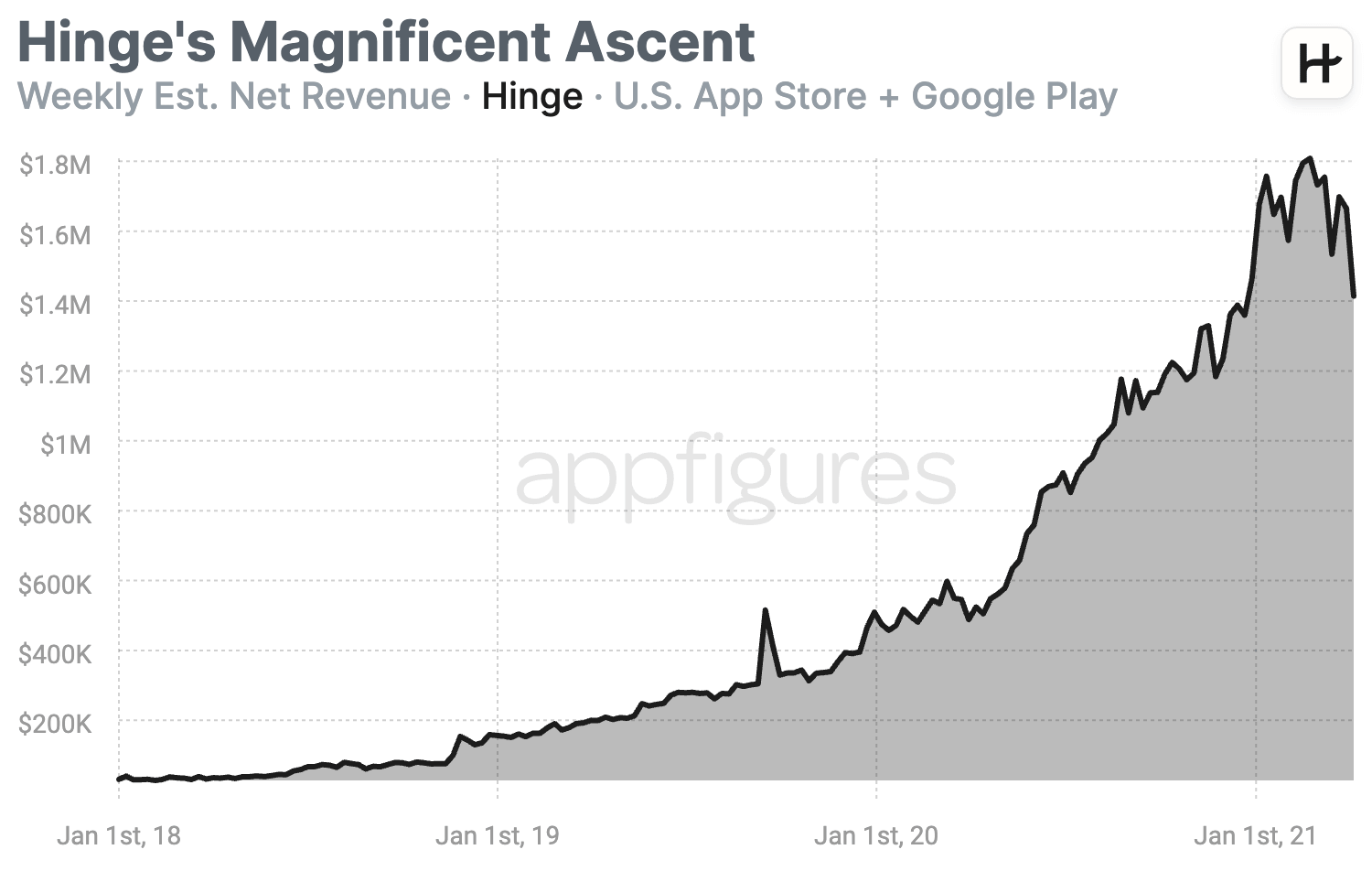
That's quite a nice mountain, if you're Hinge, at least.
What I find interesting, and why I like to see this growth so much, is that demand, aka. downloads, remained pretty much the same for most of the year.
To me, that means Hinge has quite a bit of potential that hasn't been uncovered just yet. I'm not going to call it a threat to Tinder and Bumble just yet, but it's on its way.
Hinge vs. the Competition
Dating is a hard business to break into, and the ones that are more popular these days are the ones who've been around for a while. That hasn't stopped a slew of apps from trying, but to keep the analysis realistic, I'm going to focus on the more popular ones here because those are Hinge's real competitors.
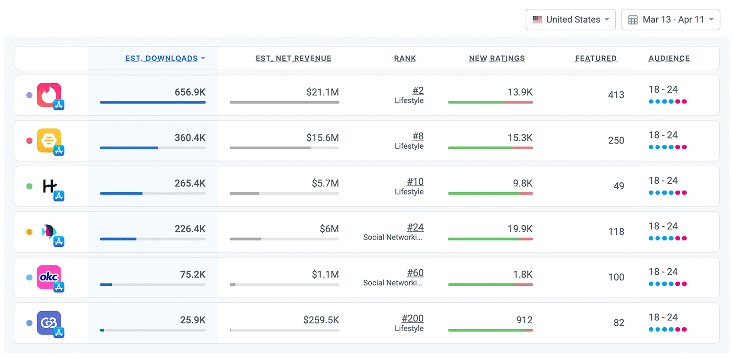
Real competitors = real money. When Hinge looks up, it sees a few big names which come with big downloads. At #3, Hinge isn't that far from Bumble, and with a big enough push, it can certainly be a challenger.
Grow Smarter, with Data.
Affordable tools for ASO, Competitive Intelligence, and Analytics.
How is Hinge Found?
Although Hinge spends handsomely on paid advertising both in and out of the store, looking at keyword popularity, demand for dating apps and not specific brand names is high. The keyword "dating" has a popularity of 60 in the U.S., and "dating apps" clocks in at a happy 70.
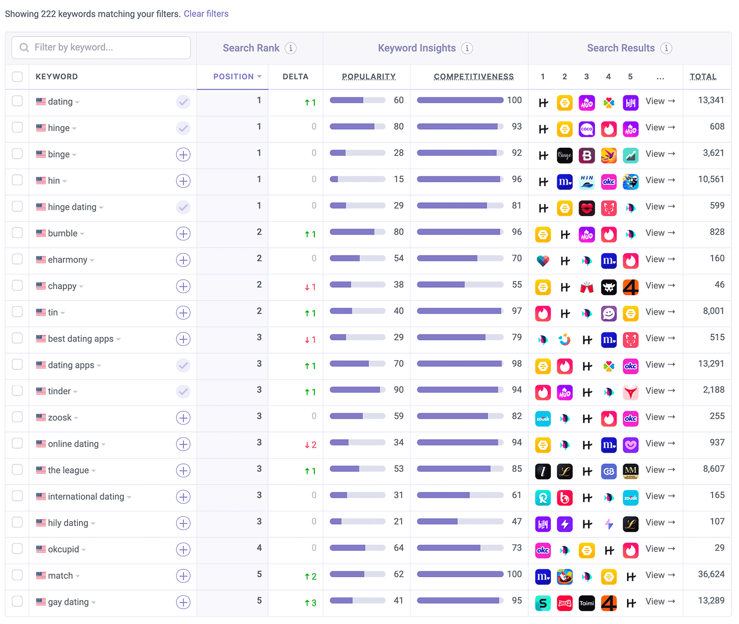
Hinge does very well for both of those, as well as for a good number of others, mainly the names of competitors.
There are two important takeaways here:
- The keyword "hinge" has a higher popularity score than the keyword "dating", which shows you that while dating is in demand, Hinge is even more in demand (and Tinder even more). You could use that to say organic growth, aka. ASO, is a waste of time in this case, and the only play is paid ads. You might be true, but. Organic and paid could work together here, and judging by the metadata, the team behind Hinge knows that and is actively taking advantage of that. Which leads me to my next point...
- When apps do very well among apps with similar features, especially the more popular types, the algorithm bunches them together and ranks them for competitors' names automatically. That's why we see Hinge performing so well for competitors. I doubt Hinge is targeting many competitor names directly using its keyword list because it's pretty wasteful.
The bottom line: Lots of downloads or not, targeting competitors is almost always a waste of characters.
Keyword Analysis - The Obvious Parts
Let's dig in by looking at the keywords Hinge is targeting in its name and subtitle. Those two send the strongest signals to the App Store's algorithm.
- Name: Hinge: Dating & Relationships
- Subtitle: Meet, Date & Find Love
Strictly based on these, here are the popular keywords the algorithm sees:
- hinge
- hinge dating
- dating
- relationships
- meet
- meet date
- meet love
- date
- find relationship
- find relationships
- find date
- find dates
- find love
- love
The good news here is that there are keywords in the name and subtitle for the algorithm to work with. The bad news is that they aren't amazing. But... (there's always a but)
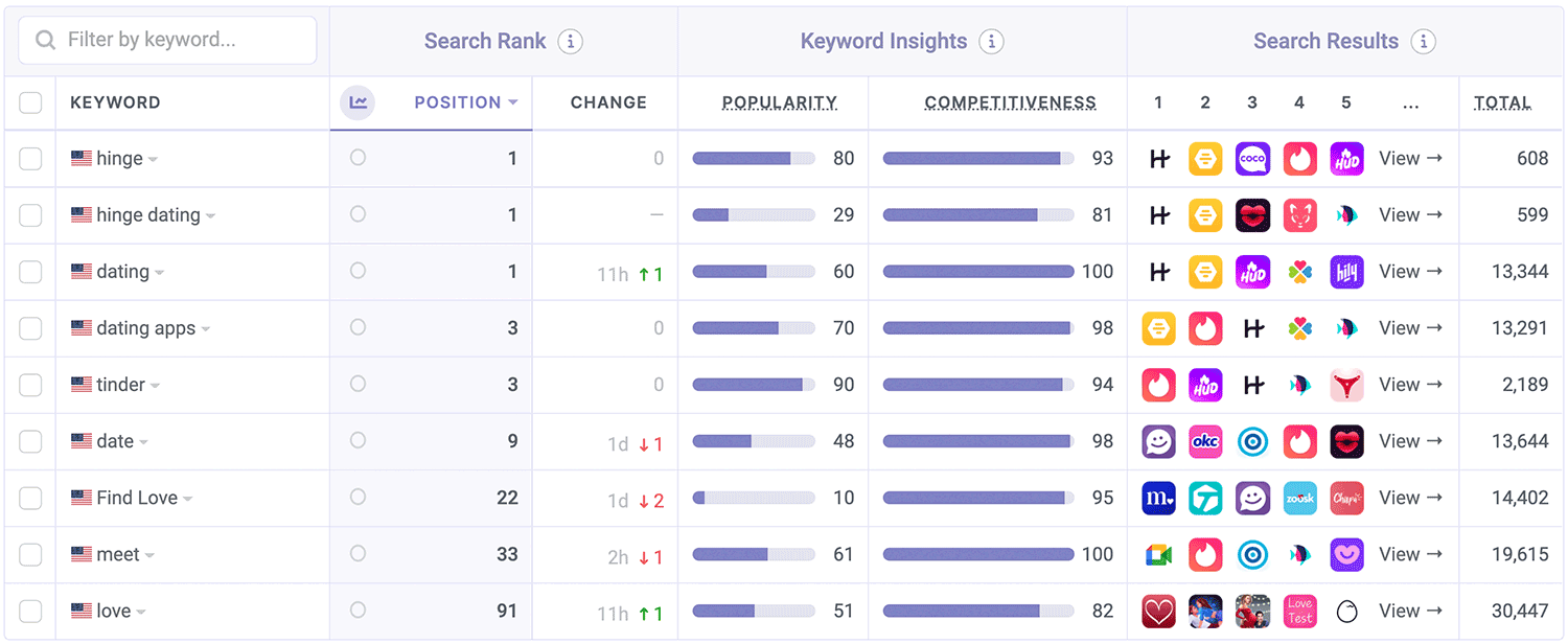
Judging by keyword popularity, dating apps trade more on their brand names and less on generic keywords. That's not to say those keywords aren't popular, but it could make it harder for an app with such a wide audience and such a narrow focus to find more keywords to optimize for.
That's not really an excuse. If your app is in a similar boat, the trick is to think about what the user wants and not just what the app provides. It makes a massive difference.
What's in the Keyword List?
Now, let's reverse-engineer the keyword list. The list isn't public, but we can attempt to uncover it by looking at all other keywords the app is ranked in. We believe it looks something like the following:
match,tinder,elite,chat,talk,single,people,finder,serious,flirt,flrting,friend,social,network
It looks like Hinge tried to fit some of what I mentioned above in here, while sprinkling competitors and describing some functionality. It's fairly on-point with what you'd expect, and many of those keywords do combine well with those in the name and subtitle.
I don't see here anything obviously awesome, but then again, dating apps have a very narrow focus.
👉 ASO Techniques: How to Optimize Your Keywords List in App Store Connect
Screenshot & Video Analysis
Hinge's screenshots were designed to make a point. You can see that by the absolute contrast of white text on a black background. Let's have a closer look.
Oh, no video...
First thing's first, best practices. Hinge seems to follow my favorites. There's a lot of contrast, the captions are concise and rather actionable, the app is shown in action, and as a bonus, it includes people.
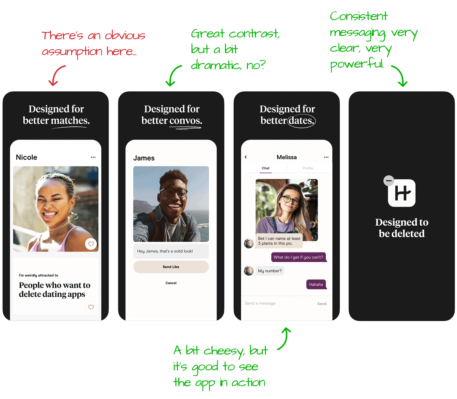
Then we graduate to the slightly more advanced side of action-generating screenshots with the last one, which looks more like an action card than it does an app screenshot. I really like Hinge's commitment to their main message, which you can find in everything that can be customized.
What's interesting here is the small number of screenshots, which I initially thought was just the usual missed opportunity, but the more I looked at it, the more it became clear it could be deliberate.
We aim to keep captions concise because we want to drive action fast. Is Hinge trying to do the same by only having the minimum number of screenshots it can?
Whether this line of thinking is right or not, however, isn't relevant. Most apps aren't Hinge and don't run ads in the NYC subway. Most apps actually have to use their screenshots to tell a story, something Hinge could do better with.
Lastly, one of the most common mistakes I see in screenshots, which is also visible here, is assuming the viewer knows what they've landed on and not introducing the app properly.
Many people will be able to connect the dots, but the ones that do, or the ones that won't try, are going to be lost. Whether you're optimizing for organic growth or spending money on driving people to your App Store page, you need the screenshots to tell the app's story from the beginning.
What Data is Hinge Collecting?
In this new(ish) section, we look at the privacy labels apps declare on the App Store. Hinge is definitely collecting, but considering it's a free app, it's not too bad.
Data Used to Track You:
- Identifiers
Linked to You:
- Contact Info
- Identifiers
- Location
- Purchases
- Sensitive Info
- Usage Data
- User Content
Looks pretty straightforward for an app that has in-app payments and has user-generated content (user profiles).
Side note: One important question Apple's privacy labels don't answer is how these pieces of information are used. I don't suspect Hinge is misusing any of these, but the real question of privacy should be around the how more so than the what. When Apple manages to get that into the App Store is when these will become more useful, in my opinion.
A Quick Look Under the Hood
Here are all the SDKs and APIs we see powering Hinge:
3rd Party + Open Source Projects:
AppsFlyer (Attribution)
Braze (Engagement)
Facebook Login (Authentication)
Firebase (Analytics)
Kochava (Attribution)
Lottie (Utilities)
SendBird (Communication)
Native APIs:
- Apple Authentication
- CoreLocation
- MapKit
- StoreKit
This is, again, a pretty clean list. It tells us a few things that are important if you're a competitor (or just curious about the business of dating apps):
- Hinge is a native app, built in Swift. At this scale, it mean there are separate development teams for different platforms.
- Paid ads are important to Hinge's growth, as can be seen by not one but two attribution SDKs, including Kochava, which tends to be on the pricier side.
- Engagement is important to Hinge, which is where Braze comes in with timely push notifications. I'd argue this is one of HInge's most important components for growth.
In other news, everything seems to be above board, and the app even uses Lottie for animateions That's always a win.
The Verdict: Show Me the Money
Hinge has differentiated itself from market leaders Tinder and Bumble by not being another app you swipe on. It's a conscious decision, one of many we can see Hinge making, that contributes to its success in the App Store.
Hinge's growing revenue per download means that it can afford to spend on paid ads and leverage that traffic to improve its organic presence. Looking at their metadata, it's fairly obvious they do.
App Store Optimization, both getting the views and converting them into downloads, play an integral role in such a competitive field, one where Hinge can grow even bigger by continuing to try and differentiate.
The Tools I Use
I did this entire analysis with our ASO tools and App Intelligence, the same ones hundreds of thousands of app makers rely on to monitor and optimize their apps. Check out some of my hands-on sessions to see it live.

