App Teardown - Learning from iHeartRadio's Mistakes
Welcome to App Teardowns, a series where we analyze the strategies apps and games use to gain visibility and downloads on the App Store and Google Play, their performance, and competition.

Music streaming, which seems to expand into podcasting, is starting to warm up again after a long period of what felt like stagnation. We've looked at Spotify and Pandora before, and in this Teardown, we'll analyze an app that merges the two offerings but isn't as popular as either on the App Store.
Overall, iHeartRadio earns a B+. Trying isn't enough.
In this guide:
- iHeartRadio by the Numbers
- Up and Down but Pretty Much All the Same
- iHeartRadio vs. the Competition
- How is iHeartRadio Found?
- Keyword Analysis - The Obvious Parts
- What's in the Keyword List?
- Screenshot & Video Analysis
- What Data is iHeartRadio Collecting?
- A Quick Look Under the Hood
- The Verdict: Low Hanging Fruit...
- The Tools I Use
iHeartRadio by the Numbers
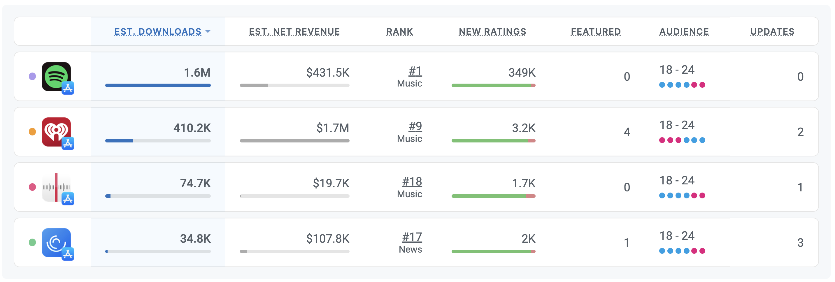
Here's how iHeartRadio is performing in the U.S. App Store, based on our App Intelligence:
- 📈 410.2K estimated downloads in the last 30 days.
- 💰 $1.7M estimated revenue in the last 30 days.
- #️⃣ 9 in the Music category.
- ⭐️ 91% of new ratings were positive in the last 30 days.
- 👋 Audience is young and evenly balanced.
- 🏅 Competitors include music streamers and podcast players, a wonderful party.
Up and Down but Pretty Much All the Same
Streaming services have been evolving a lot lately, and by evolving, I really mean looks for ways to continue to be attractive. Radio is nice, but music on demand is nicer. Then, the podcast renaissance came.
We can see the impact of trends changing quickly on iHeartRadio's downloads:

The trend in the chart above represents weekly downloads going back to the beginning of 2018. a total of 39M downloads across the App Store and Google Play, according to our App Intelligence.
But the trend isn't an up-and-to-the-right kind trend. Instead, it's a trend that suggests surviving more than thriving. If you recall, we saw a similar trend when we analyzed The Podcast App and Spotify, both competitors of iHeartRadio.
It's not an easy trend to fight, but the upside is great demand, so it's probably worth the effort.
iHeartRadio vs. the Competition
iHeartRadio competes across several different types of apps, which pins it against a variety of different apps with different popularities. One thing unites the apps I selected for comparison, and it's that they all rank better than iHeartRadio for the terms it's targeting.

Interesting, right?
A few things that stand out:
- Spotify, which we analyzed in season 1 of app teardowns, is a very strong opponent. Now that they're diving into podcasts, it'll be hard to compete with them there.
- iHeartRadio monetizes well through the App Store, which is why organic growth should (and from the looks of it, is) an focus.
- Without focus, apps with fewer downloads and ratings rank higher. That's not great for iHeart.
Grow Smarter, with Data.
Affordable tools for ASO, Competitive Intelligence, and Analytics.
How is iHeartRadio Found?
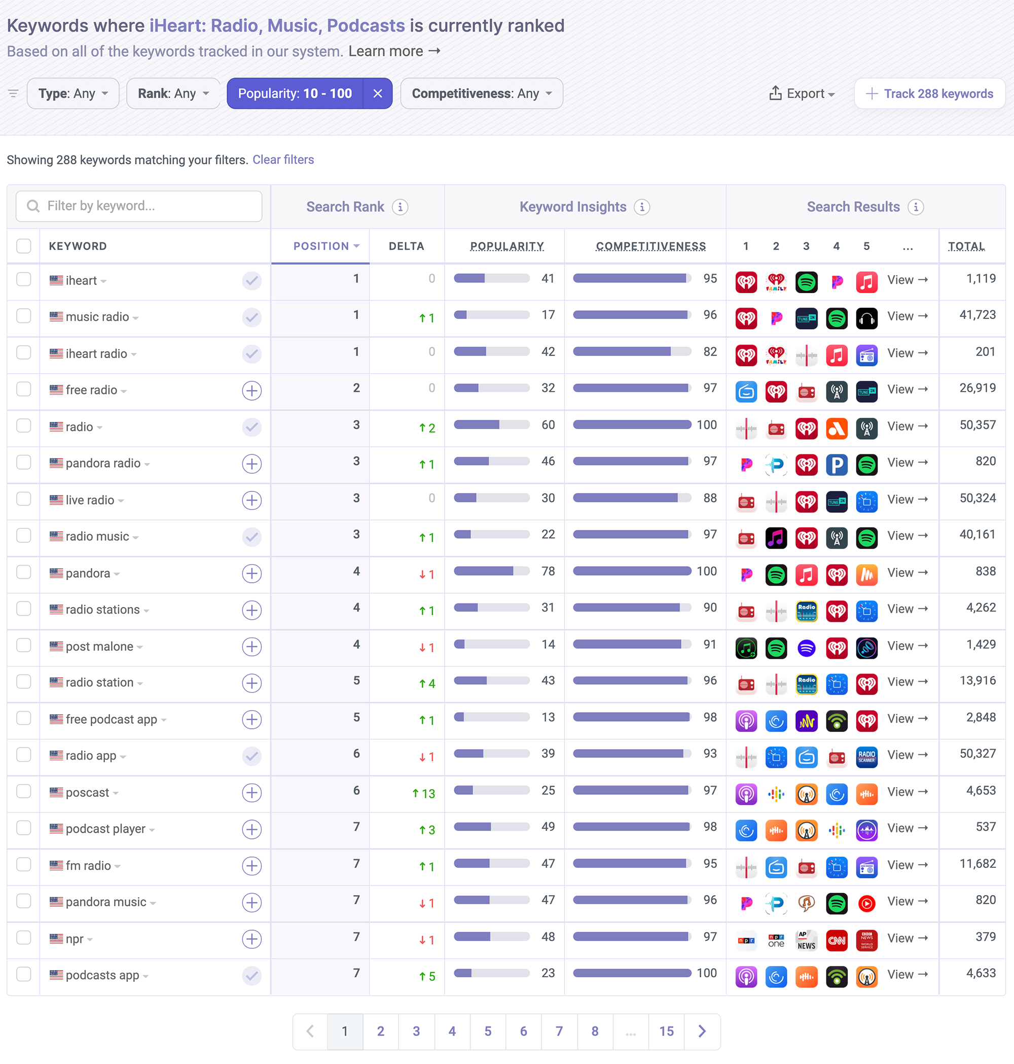
How do you compete with such a variety of competitors and stand out in the process? We'll look at that in this Teardown. To start, here are the most popular keywords where iHeartRadio has top ranks.

There aren't as many as I had hoped to see.
iHeartRadio is most likely spending time on optimization and in-store user acquisition. Where we can see it is its core value proposition. Radio.
iHeartRadio ranks 3rd for the keyword radio in the U.S. App Store and in the top 10(ish) for other popular keywords that include the word radio. That's not (only) the downloads, which iHeartRadio has, doing the works. Rather, it's years of focused ASO on that keyword.
Lately, that focus expanded to include music and podcasts, but the algorithm remembers.
Keyword Analysis - The Obvious Parts
Let's dig in by looking at the keywords iHeartRadio is targeting in its name and subtitle. Those two send the strongest signals to the App Store's algorithm.
- Name: iHeart: Radio, Music, Podcasts
- Subtitle: Audio you love, all in one app
The Essentials (4 of 5)
- Keywords aren't duplicated
- Using more than 20 characters in the name
- Using more than 20 characters in the subtitle
- Most popular keywords first
- Keywords combine to create more search terms
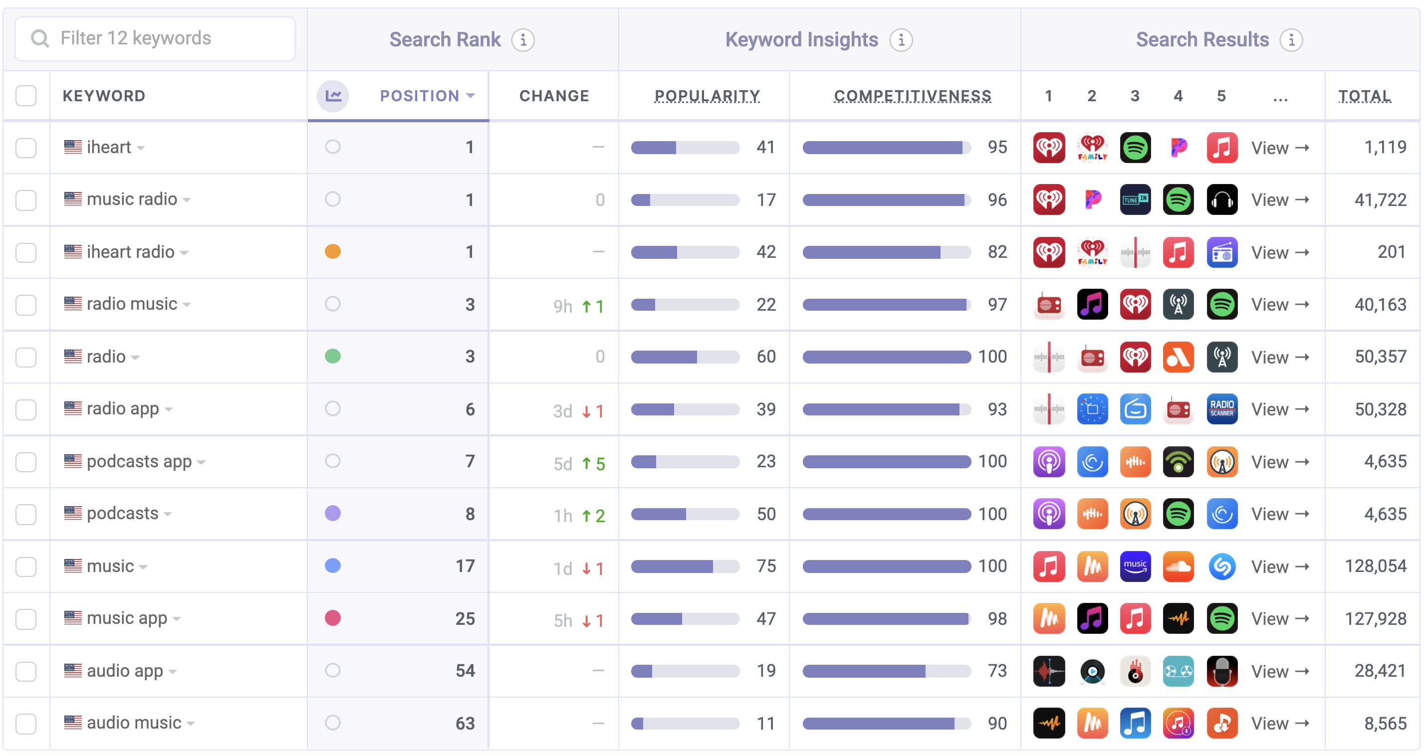
Strictly based on these, here are the popular keywords the algorithm sees:
- music
- radio
- podcasts
- music app
- iheart radio
- iheart
- radio app
- podcasts app
- radio music
- audio app
- music radio
- audio music
Looking at the name, it's pretty clear what the iHeart team is going after. I'd say this is a good set, but I'm not entirely sure what the goal of the subtitle is, and that's costing iHeartRadio quite a few good keyword combinations...
And on top of that, the name isn't focused on one intent but rather three. Not great.

The trio iHeartRadio is after includes radio, podcast, and music. We've analyzed apps that focus on each of those before, and if you read those teardowns, you know that each of those is very competitive.
Targeting all is not a bad move if you have the downloads and ratings to support it, but even if you do, it's not the kind of thing you should just turn on. It should happen gradually.
Let's talk about focus.
Although you get 30 characters for the name and subtitle, the position of each keyword insinuates its weight, and if you take this thought a step further, you'll see that the more characters you end up using, the less weight each keyword will have as the algorithm sees it.
Normally, when you're focused on a single target, the difference in weight isn't significant enough to be problematic. But since iHeartRadio is going after all three at the same time, they're really devaluing radio while not putting much weight on podcasts to begin with.
The ranks reflect that pretty clearly.
There is, however, a strategy where this would work, and that's if you train the algorithm, over time, to index the app for each of these individually. The algorithm remembers. And once you're done with that, change the name to have all three.
It's a more advanced strategy, but apps with diverse focuses that are so competitive require more work.
That was a long one, moving on!
What's in the Keyword List?
Now, let's reverse-engineer the keyword list. The list isn't public, but we can attempt to uncover it by looking at all other keywords the app is ranked in. We believe it looks something like the following:
live,news,streaming,talk,station,playlist
This keyword list feels pretty basic to me, and I'm a little bit surprised.
Now, it's possible my analysis is missing some keywords, but if it isn't, there are a few easy opportunities here that iHeartRadio can easily take advantage of. For example, the keyword play combines with music very well but isn't on this list. Another is song, which is a related keyword for music and combines with the rest pretty well.
I've seen enough apps that don't utilize the keyword list correctly, so this isn't shocking. But... it's these little missed opportunities that can make the difference between ranking 1st and 3rd for a competitive keyword, and that can make the difference between a download and a not download (for lack of a better term).
👉 ASO Techniques: How to Optimize Your Keywords List in App Store Connect
Screenshot & Video Analysis
No video, but it's not very surprising. Everyone has some expectation when they hear the word radio, so it could be reasoned that a video won't help much.
As you'd expect, I disagree here.
While it might not make a big difference, as we see attention spans continue to get shorter and shorter, and with competition becoming more fierce, a video that walks the user through what the app offers quickly can be the difference between a download and a pass.
On to the screenshots, which do a good job showing off what the app has to offer. I like the panorama view initially, which makes it feel playful, the colored background and white captions, which are very easy to read, and the use of people.

The Essentials (3 of 5)
- Using 7 or more screenshots
- There's enough contrast
- At least 80% of screenshots have captions
- Captions are easy to read
- Asking for the download
One thing that's nice here is that if you look at these in search results, where the first three screenshots are shown, the value proposition is placed right in the middle, and it's pretty easy to see it right away. That's a very nice way to show that off.
There's one problem - Even on a larger iPhone, the font is too small to read comfortably, so while great in essence, the implementation can be improved.
In general, the text on these screenshots can be a bit larger. Remember, when text isn't very easy to read, it's very easy to ignore it.
Takeaways:
- Make your captions very easy to read
- Look at your screenshots in the search results view and make sure your value proposition is very obvious and clear
- More contrast is more better
- If you can, make an App Preview for your app and walk the viewer through the exciting bits
What Data is iHeartRadio Collecting?
In this new(ish) section, we look at the privacy labels apps declare on the App Store. iHeartRadio is definitely collecting, but considering it's a free app, it's not too bad.
Data Used to Track You:
- Identifiers
- Location
- Usage Data
Linked to You:
- Contact Info
- Diagnostics
- Identifiers
- Location
- Purchases
- Search History
- Usage Data
- User Content
Overall, a pretty standard list. Now that we've been poking at privacy labels for a while, a pattern is beginning to emerge. Apps usually collect as much data as they can, and users generally understand that it's a necessity.
I don't see anything obviously offensive here, and that's also the problem with privacy labels. Because they don't offer any insight into what's being done with the data that's collected, they're not very useful and are easily ignored.
I was hoping for more in iOS 15, but A/B testing is going to keep me happy for a while. Maybe next year.
A Quick Look Under the Hood
Here are all the SDKs and APIs we see powering iHeartRadio, which could offer a glimpse into what the privacy labels fall short of offering.
3rd Party + Open Source Projects:
- AdMob (Ads)
- Adobe Mobile (Analytics)
- AFnetworking (Networking)
- AppAuth (Authentication)
- AWS SDK (Utilities)
- Branch Metrics (Attribution)
- Braze (Engagement)
- comScore (Analytics)
- Fabric (Analytics)
- Facebook Analytics (Analytics)
- Facebook Login (Authentication)
- Facebook Share (Utilities)
- Firebase (BaaS, Analytics)
- Google IMA (Ads & Monetization)
- Google Sign-In (Authentication)
- Kingfisher (Utilities)
- Moat (Insights)
- Pop (Utilities)
- Realm (Storage)
- SocketRocket (Networking)
Native APIs:
- App Tracking Transparency
- Apple Authentication
- Apple Local Authentication
- Apple Watch Connectivity
- CloudKit
- Core Spotlight
- CoreBluetooth
- CoreLocation
- GameplayKit
- MapKit
- StoreKit
There's a lot going on under the hood of iHeart! It's been around long enough that it's to be expected.
Analytics, utilities, attribution, engagement, and some more analytics. That's a fair summary of what we see here, and for the most part, there's nothing obviously bad here. Fabric's long gone, and Facebook Analytics will be too, but I wouldn't call those bloat just yet.
Looking at these SDKs, we can tell the priorities of the team behind the app. Make it easy to access the app, track user interaction and use it to engage. A typical pattern when there's a UA/growth team involved.
The Verdict: Low Hanging Fruit...
At first glance, iHeartRadio is doing most things right. There are a bunch of useful keywords in the name, the subtitle has some keywords too, the screenshots have contrast and captions. What else can you ask for?
But... when you take a closer look you start to see some issues. The keywords are very competitive and not focused, the subtitle is not very useful at all, the text in the screenshots is too hard to read.
That's both good news and bad news.
Bad because it's currently costing iHeartRadio in ranks and in downloads. If you were wondering why it's not the #1 result for more keywords, this is your answer.
This is also good news. All of these are pretty easy to fix. A fresh coat of paint on the already good screenshots should have an impact on conversion. A little more keyword research and optimization, and there will be more page views.
A little will go a long way here.
The Tools I Use
I did this entire analysis with our ASO tools and App Intelligence, the same ones hundreds of thousands of app makers rely on to monitor and optimize their apps. Check out some of my live session videos to see how I do it.

