How To Design Screenshots That Result in Downloads! Musts, Tips, and Don'ts

App Store Optimization has two sides, keyword optimization, which gets people to view your app's page, and screenshot optimization, which turns those views into downloads. One needs the other, and the two build on top of each other to give your app the downloads it deserves.
But what are views good for if they're not converting to downloads? That's what this guide is all about.
In this guide:
- Good Screenshots = More Downloads
- The Philosophy Behind Good Screenshots
- The 3 "Musts" of a Good Screenshot Set
- 3 Advanced Tips for Even Better Conversion
- You Won’t Get It Right the First Time, and That’s Okay
- Whatever You Do, Don’t Do This!
- Your Turn!
Good Screenshots = More Downloads
Screenshots take up the most space on your app's page and command the most engagement because we're visual beings. That's why they're your most valuable tool in getting people who are looking at your app to understand what it can do for them.
That's the main point of the screenshots. They help users understand what the app can do, so they can decide whether what it does is in line with what they need. When the two align, you get a download.
The Philosophy Behind Good Screenshots
Don't make them think. That's really all there is to it.
Your screenshots should answer the question, "is this the app I need?" and nothing else. If it doesn't answer that question fast, people will simply tap the back button, go to the next app in the search results list, and lose you the download. Even worse, you just handed your competitor a potential download.
The tips below, both musts and advanced, will help ensure your screenshots get to the point quickly and don't hand your hard-earned views to a competitor.
The 3 "Musts" of a Good Screenshot Set
If your keyword optimization is good, people viewing your app's page got there by searching for something the app does. It's now up to you to "seal the deal" and get them to download it or confuse them away to a competitor.
Here are the most important things you can do to ensure your screenshots convert:
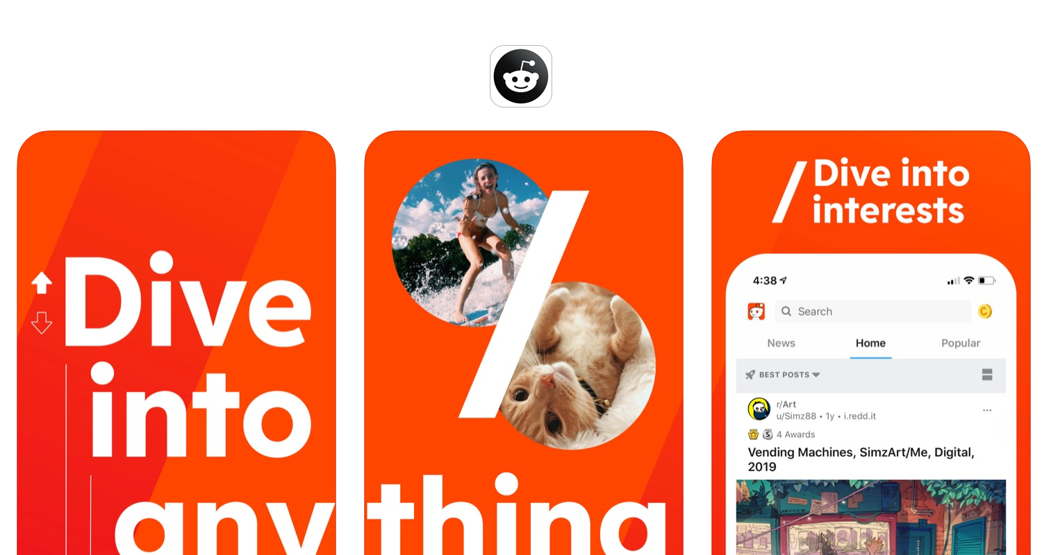
Highlight What's Important
The best way to help people choose your app is to show them they'd get what they want. You've already done the keyword research necessary to know what people are looking for, so it shouldn't be a stretch to use the same mindset when choosing what to include in your screenshots.
The best things to show are the benefits of your app or the best parts of your game. The more unique the better. But keep it simple. If what you're trying to show off with requires too much thinking to understand, it's more likely to push them away.
This is easy when you can just show the app in action, but some things you'd want to show off may not have any UI elements to associate with. That's perfectly fine. You have two alternatives: 1. Show the most relevant UI, even if it's not perfect. 2. Skip UI altogether and just use text.
Reddit mixes these pretty well:

Grow Faster + Smarter.
Affordable tools for ASO, Competitive Intelligence, and Analytics.
Add Contrast
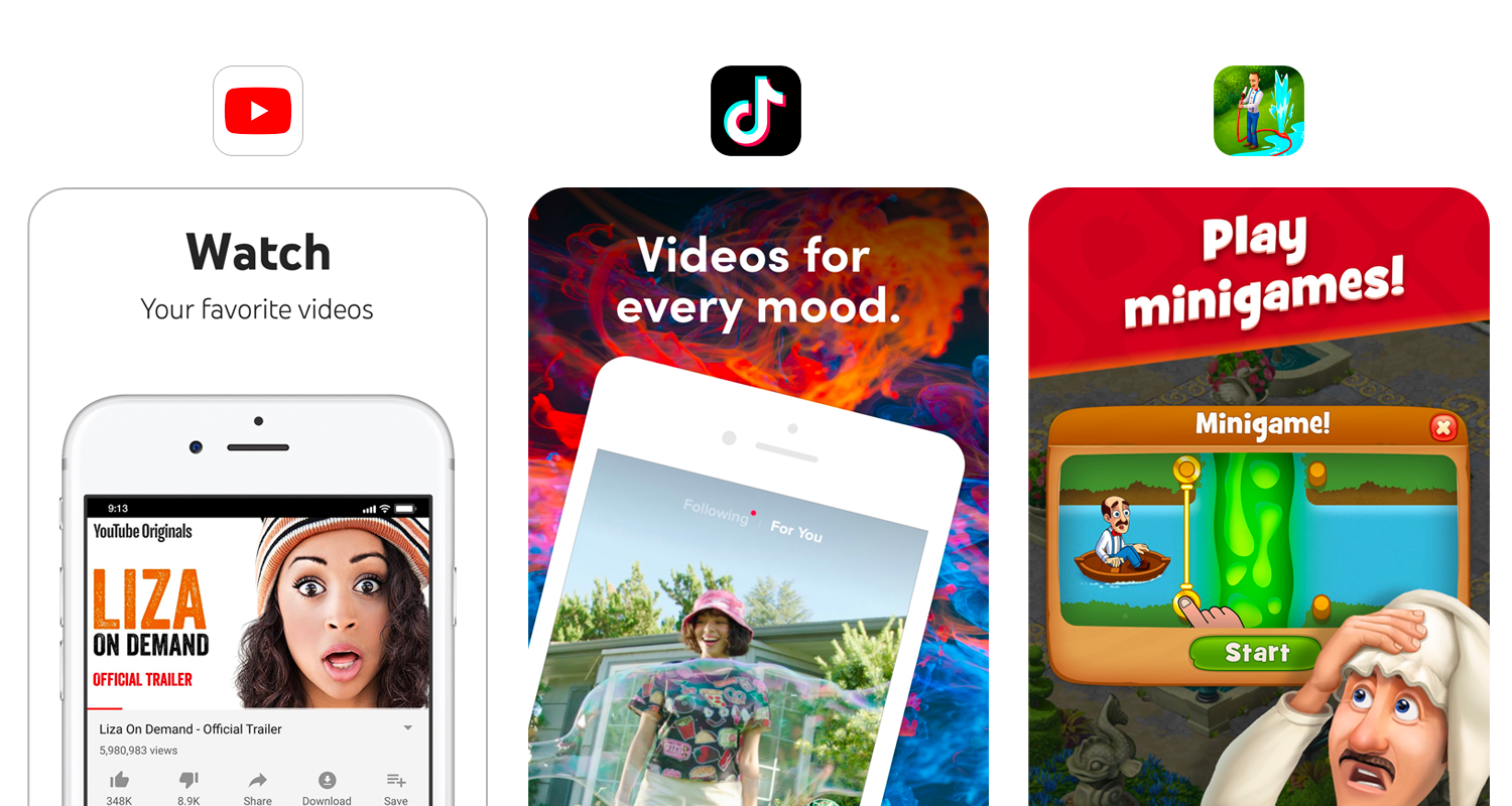
The screenshots above have a lot of contrast between the background and the UI/text, which makes our eyes naturally focus on those. That's great because it means people who land on the page are more likely to actually look at the content you picked so carefully, and it's all automatic.
Contrast makes a huge difference when it comes to conversion.
The easiest way to achieve contrast is to select a dark background and use light text. There are of course many design patterns that you can choose from, whether solid, patterns, or even a multi-screenshot collage. Regardless of which one you choose, always always always maintain contrast.

Use Actionable Captions
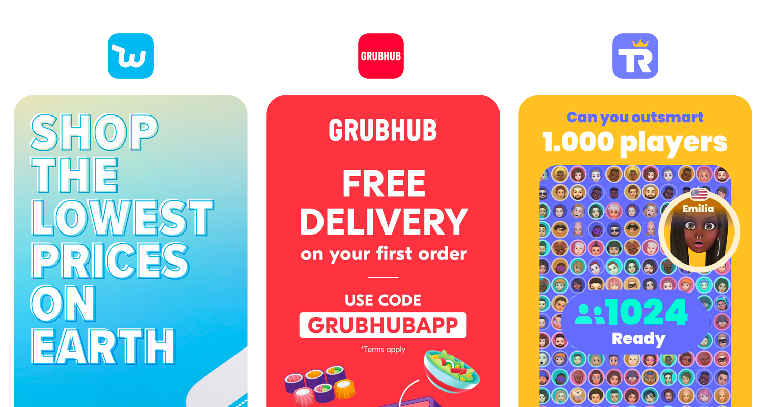
The last must on our list is also the one that ties it all together. You know what they want, you know how to make it visible, all that's left is to spell it out.
Don't wait for them to try and interpret the screenshot, shortcut the process by captioning your screenshots. If you've followed the first tip, what you're showing in those screenshots is what's going to answer the "what can this app do for me?" question. And when the answer is correct, you get a download.
Succinct captions that drive the user to take action increase conversion. Take a look

3 Advanced Tips for Even Better Conversion
If you implement the tips above, you're already most of the way there with your optimization, and if you do those well, you can expect an increase in conversion rate and downloads. But if you want more, here are our favorite advanced tips to squeeze even more conversion.
Bring People into the Mix
Using people in your screenshots humanizes them and makes them more approachable. Why? Because people are used to other people. We know that a smile is a positive, so we tend to be more relaxed, or that a serious look means business.
By bringing people into your screenshots, you can make them instantly easier to look at, which increases the likelihood that they'll actually read the captions and answer the question of "is this app for me?" with a yes.
Our friends at SplitMetrics dove deeper into how integrating people into screenshots can improve conversion, which we recommend reading if you're going to give it a try.
Use Familiar Colors
Continuing with the theme of familiarity, another way to get more engagement for your screenshots is to use colors the person looking at them is already used to. What most people think about when they read this is to use their brand's colors, and that's not a bad idea, but that's not what we're referring to here.
If your type of app lends itself to a specific color, use that color in your screenshots. For example, an app about soccer news can use green (color of the field). A game about fishing could use blue (color of water), and a news app could use a black and white theme (physical newspaper).
Point Where You Want Them to Look
Colors, text, buttons. Whether on the App Store or Google Play, there's a lot to take in. The more there to look at the less chances you have to convert. One thing you can do, and this one's probably the most involved of all the tips in this guide, is to direct the flow. Help the person looking at your app by telling their eyes where to go.
You can do that by pointing towards where you want them to look. It could be an arrow in the screenshot that points to the next, a character literally pointing towards the "Get" button, or a combination.
You Won’t Get It Right the First Time, and That’s Okay
Intuition and gut are a great starting point because you probably know your audience well. But, squeezing the most out of your screenshot may require things that aren't intuitive. When it comes to creatives, one approach doesn't (necessarily) fit every audience, and what may seem good to you may not be for your users.
Luckily there's a solution—Experimentation!
Step one, keep an open mind. Step two, plan at least one alternative to every set of screenshots you design that's different. If your screenshots have a dark background and light text create an alternative set where the background is light and the text is dark. If your set has captions that focus on one element of your app, try another set that's broader. Play with the order of the screenshots, switch up the colors; you get the idea.
Measure. Give each set a few weeks to settle in, record the number of page views, downloads, and calculated conversion rate. After you've tried a few, pick the set with the best conversion—that's your set!
👉 How To A/B Test Screenshots in the App Store
👉 How To A/B Test Screenshots on Google Play
Whatever You Do, Don’t Do This!
We covered a lot of ground so far, and there's enough here to really push your downloads. But if you take one thing from this guide, let it be what not to do because just like what's above has the potential to improve your conversion rate, doing these is sure to hurt it.
Don't Skip the Captions. Caption your screenshots so people know what they're looking at or what they can get from it. If you don't, they'll either guess (best-case scenario) where they can get it wrong or just ignore the screenshot. Kind of a lose-lose situation. Give each screenshot a caption. If you don't enjoy copywriting, start by describing what's in the screenshot, then make it shorter. 4-5 words is a good length to aim for.
Don't Have One or Two Screenshots. People don't appreciate laziness and don't reward it with a download. We already said screenshots are the most important tool you have to show people who visit your app's page what the app does. One or two screenshots just aren't enough and are not going to give people enough to see to answer the "is this app for me?" question. The average app uses five, and we suggest using at least that many.
Don't Make Them Guess. If you're highlighting UI that's complicated, too crowded, or too small, people will simply ignore it. They won't pinch to zoom so they can read button labels or guess what happens when you tap those buttons. They'll just ignore those and aren't likely to download the app. Take the time to find the right views to highlight the app's functionality and, if necessary, create a zoomed-in view.
Your Turn!
How well are your screenshots converting? The key to success with ASO is to continue making changes, and base those on data. Appfigures has all the tools you need to find and evaluate keywords, track performance, and monitor competitors. Get started →

