App Teardown - Why TurboTax isn't Getting to #1 with a Million Downloads
Welcome to App Teardowns, a series where we analyze the strategies apps and games use to gain visibility and downloads on the App Store and Google Play, their performance, and competition.

It's tax season, and for tax preparation and filing apps, this is the only season that matters. For a few short months, apps like TurboTax are in demand and almost immediately forgotten, making ASO extremely important.
In this App Teardown, we're going to look at the most recognizable name in tax preparation apps—TurboTax.
For all the things it does right, there's one thing it doesn't, a strategy secret that's allowing competitors with far fewer downloads to beat it on big keywords.
Overall, TurboTax earns a modest B+, because it really tries but falls back on paid ads.
Good: beautiful and actionable screenshots
Not so good: there are some obvious mistakes with these keywords...
In this guide:
- TurboTax Block by the Numbers
- The Season is Short but Big
- The Competitive Landscape
- Where is TurboTax Ranking?
- Keyword Analysis - The Obvious Parts
- What's in the Keyword List?
- So, What's Missing???
- Let's Look at those Screenshots
- What's TurboTax Tracking?
- A Quick Look Under the Hood
- The Verdict: Gotta Play the Game
- ASO Tools Designed for... You
TurboTax Block by the Numbers
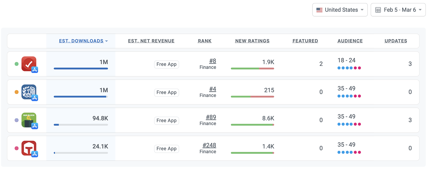
Let's begin by gaining some context. Here's how TurboTax Block is performing in the U.S. App Store, based on our Competitor Intelligence:
- 📈 1M estimated downloads in the last 30 days.
- #️⃣ 8 in the Finance category.
- ⭐️ 65% of new ratings were positive in the last 30 days.
- 👋 Audience is young and leans male
- 🏅 Competitors include H&R Block, IRS2Go, and TaxSlayer
The Season is Short but Big
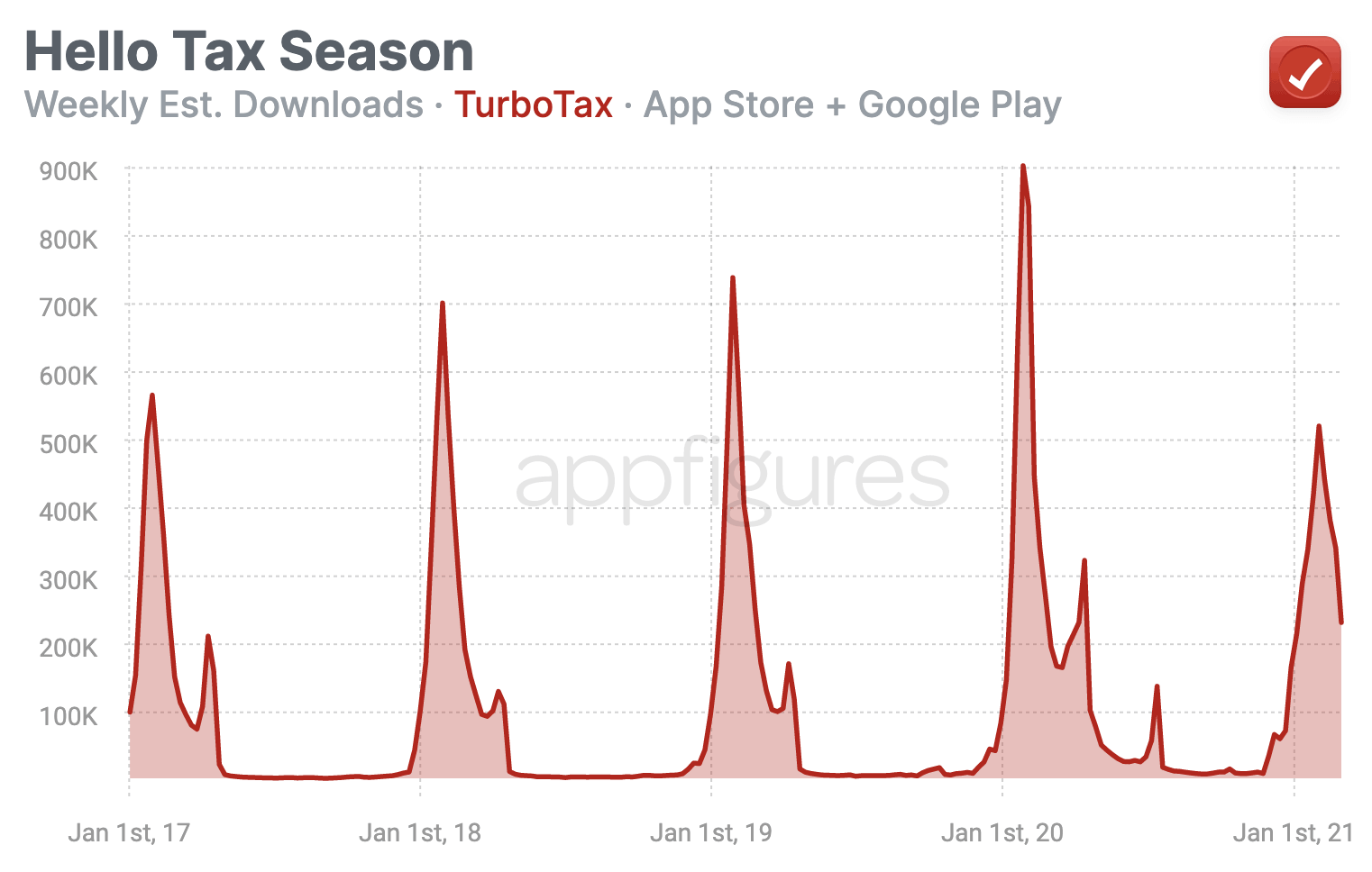
Tax season is short and comes every year. While there some demand for tax prep apps throughout the year, real demand spans just a few short months. Looking at download estimates, we can see this seasonality has been very consistent over the years:

Most apps and games are in demand year-round, which makes optimizing and experimenting fairly straightforward. TurboTax, however, has a very specific season. January to April is where TurboTax is in demand.
This means that there are eight whole months for the folks at Intuit, the company behind TurboTax, to find the best set of keywords, the screenshots with the highest conversion, and the smoothest onboarding flow.
Did they do that this year? Maybe. I'll explain why below.
The Competitive Landscape
Although there are quite a few apps for taxes, only a small handful come up consistently in search results, and here they are:

Note: Credit Karma seems to come up for a bunch of searches involving the keyword tax, but it's not at all relevant here and rarely makes the top 5 that we didn't include it here.
TurboTax is going toe-to-toe with the IRS's own app but has a slightly younger user-base than all of its competitors, which likely has to do with who they're targeting with their paid ads.
If you looked at the category ranks and wonder why the same downloads give the IRS a better rank than TurboTax, the answer is simple - recency. Apple's category ranking algorithm looks at recent trends, and as it turns out, the IRS had more downloads over the last few days.
We'll see how this impacts keyword ranks in just a little bit.
Where is TurboTax Ranking?
This combo of name, subtitle, and keyword list gives TurboTax a bit more than just the name and subtitle alone. Here are some of the highlights:

Are you also thinking to yourself, "this list is a bit short"? Me too.
With a million downloads, you'd expect more ranks, but having downloads is just a part of the ranking equation. You also need a good set of keywords, and TurboTax doesn't have that exactly, as you'll see in my analysis below.
Grow Smarter, with Data.
Affordable tools for ASO, Competitive Intelligence, and Analytics.
Keyword Analysis - The Obvious Parts
Let's kick off the analysis with the keywords TurboTax is using in its name and subtitle. Those send the strongest signals to the App Store's algorithm.
- Name: TurboTax Tax Return App
- Subtitle: File 2020-2021 Taxes
Strictly based on these, here are the popular keywords the algorithm sees:
- turbotax
- tax
- tax return
- tax app
- tax file
- tax 2020
- tax 2021
- file tax
- file taxes
- 2020 tax
- 2021 tax
- 2020 taxes
- 2021 taxes
- taxes
- taxes 2020
- taxes 2021
This list is pretty lackluster... it wastes precious characters on "app," which isn't useful at all and includes some terms I can't imagine anyone would think to search for, and the data backs me up here.
I suspect this was copied over from Android, where appending "app" to the app's name is much more common and is likely not based on direct data from the App Store but rather the web. A mistake I've seen too many mobile marketers make.

The results aren't that bad, nor are they that great. For an app with so many downloads with competitors that aren't even close, getting better results isn't hard.
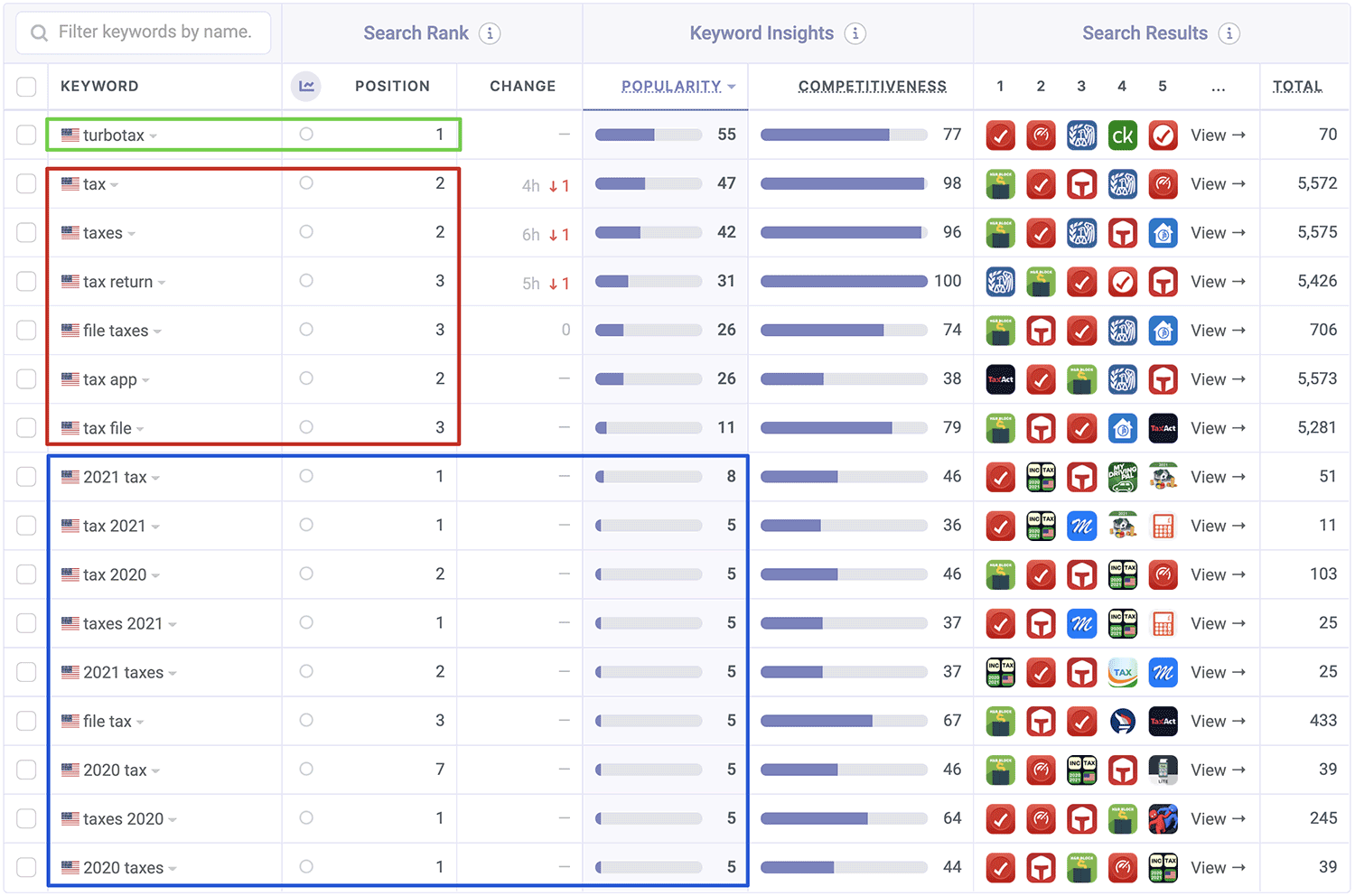
I broke these up into three sections:
- Green - Branded. If they weren't #1 here they'd be in big trouble.
- Red - Popular keywords. There's a handful of good keywords here. Enough, no, but more than nothing. TurboTax isn't #1 for any of them.
- Blue - Unpopular keywords. This combination of name/subtitle is targeting quite a few keywords with low/no popularity, which, given the short season/high stakes, is extremely wasteful. I'd even go as far as saying this wasn't tested. I hope I'm wrong...
Why is the red region so red? Continue reading to find out.
What's in the Keyword List?
Now, let's reverse-engineer the keyword list. The list isn't public, but we can attempt to uncover it by looking at all other keywords the app is ranked in. We believe it looks something like the following:
preparation,calculator,free,tracking,tracker,expert,income,deduction,act,irs,planner,cpa,state
Unlike the wasted opportunities we saw before, the app's hidden keyword list is pretty decent.
You have words that combine well with the main term (tax) like "preparation", "calculator", and "income". I see a few competitor names, and while I'm usually against doing that, I think it could have some value in this case with a simple rationale - the "how" here isn't relevant. It's really down to which solution will be easier and save more money. Possible in reverse order.
The trick then is to highlight the unique benefits fast. Screenshots are the first obvious way to do it, but that's not the only place. The app's icon can be useful here, as are the name and subtitle.
So, What's Missing???
Ratings!
If you've been active with ASO for long enough, I'm sure you've come across keywords where the top result wasn't necessarily the one with the most downloads. If that #1 app wasn't yours, you've probably scratched your head once or twice trying to understand why.
Why does Apple's ranking algorithm put H&R Block, with its ~100K downloads, ahead of TurboTax, which has 10x the downloads?
Remember how we said Apple looks at the recent trend of downloads for category ranks? For keyword ranks, they're also looking at the number of new ratings.
TurboTax's Ratings:
- All-time: 594K
- Positive (last 30 days): 1.2K
H&R Block's Ratings:
- All-time: 83K
- Positive (last 30 days): 8.2K ← this is the key
Although all-time TurboTax beats H&R Block's ratings, over the last 30 days, TurboTax's added a fraction of what H&R Block did, and that's why they couldn't take over.
Earlier in the year, when TurboTax had more new ratings than its rivals, it also managed to secure the top spot. It's that simple.
Now what? You need more ratings, and you need them now. That doesn't mean you should buy them! But it does mean that you should optimize how you ask for them, so every request results in a rating.
🎓 Guide: Guides How To Get More Ratings for Your App or Game Overnight
Let's Look at those Screenshots
Beautiful! I really like what TurboTax did here, and for a bunch of reasons that I don't get to list too often.

- Easy to read - there's a good amount of contrast, a friendly font, and even though there are a bunch of words there's enough spacing to not make them look overwhelming.
- Actionable - Most of these captions answer questions I would have as a potential user.
- Real people - Seeing real people in a screenshot helps humanize the app and reduce the friction it takes to download.
- Clear benefits - Almost every screenshot shows a useful benefit that's relevant and feels necessary.
- 9 out of 10 - Almost every possible screenshot slot is in use. It's not a perfect 10, but it's closer to that than the average (of 6)
The only nitpick I have here is the vagueness in those two screenshots I highlighted. It's not terrible at all, but if we're going for amazing, I'd turn those into something more meaningful because when people read things they can't relate to, they simply ignore them and move on.
What's TurboTax Tracking?
Apple's new(ish) labels are starting to get noticed, making them more important for converting views into downloads.
Here are all the pieces of data TurboTax is collecting about its users:
- Identifiers (User ID, Device ID)
- Usage data (Advertising behavior and product interaction)
- Search History
- Diagnostics (Crash and performance data)
- Purchase history
- Contact info
- Financial info
- Content you generate
Looks like a lot, but it all mostly makes sense. The only one that stands out is search history, but I've been seeing that come up a lot more often when looking through the App Store than I'd expect.
Side note: Tracking isn't inherently bad, as long as it's done carefully and has a purpose. I think Apple's labels are a good way to kick off being explicit about what's being tracked, but they'll need to evolve a bit more before that can happen. Under the hood, Apple has more information than what it shows in the App Store. I expect the labels to evolve to include what Apple isn't showing yet in the near future.
A Quick Look Under the Hood
And lastly, a look at the tech that's powering TurboTax. In one word—Apple.
TurboTax is a native app built with Swift and takes advantage of a variety of Apple APIs, from Apple Pay to AR Kit, Pass Kit, and even Sprite Kit.
There are no data-hungry trackers that we can see, not even ad attribution (Adjust was uninstalled some time back).
Overall, this is a very clean app that takes advantage of a good number of exclusive iOS features. That explains why TurboTax is the only app of its group to be featured by Apple.
The Verdict: Gotta Play the Game
Overall, TurboTax's seasonal demand is an opportunity to really advance its organic downloads and complement its paid ads to get more bang for its back. I believe that happened to an extent, but not with keywords or ratings, the most important aspects of discovery.
When it comes to keyword ranks, the game isn't just about downloads. That can be an opportunity for apps with fewer downloads. I see it as a secret weapon.
Important: I'm going to repeat this one more time - this isn't an invitation to buy ratings, it's not worth the risk, and will only have short-term improvements if you're not caught. Build those ratings organically.
ASO Tools Designed for... You
I did this entire analysis with our ASO Tools and App Intelligence data, the same ones hundreds of thousands of app makers rely on to monitor and optimize their apps. You can (and should) use them, too. Get ahead and outsmart your competitors with Appfigures. Get going →
Download and revenue figures used in this App Teardown are estimated.

