App Teardown - Yummly Owns Search Results
Welcome to App Teardowns, a series where we analyze the strategies apps and games use to gain visibility and downloads on the App Store and Google Play, their performance, and competition.

Cooking is an art form for those who are very good at it. For the rest of us, cooking, much like ASO, requires some instructions.
Recipe apps aren't new to the App Store, and at the helm is one you may have even downloaded yourself at some point—Yummly.
Yummly is the #1 result on the App Store for recipe and the app we'll analyze in today's Teardown.
Overall, Yummly gets a B+, which was almost an A-, but there are a few avoidable mistakes here.
In this guide:
- Yummly by the Numbers
- Another COVID Baby
- Yummly vs. the Competition
- How is Yummly Found?
- Keyword Analysis - The Obvious Parts
- What's in the Keyword List?
- Screenshot & Video Analysis
- What Data is Yummly Collecting?
- A Quick Look Under the Hood
- The Verdict: Less Guessing = More Downloads
- The Tools I Use
Yummly by the Numbers
Here's how Yummly is performing in the U.S. App Store, based on our App Intelligence:
- 📈 30.1K estimated downloads in the last 30 days.
- 💰 $85.3K estimated revenue in the last 30 days.
- #️⃣ 107 in the Food & Drink category.
- ⭐️ 91% of the 689 new ratings received in the last 30 days were positive.
- 👋 Audience is slightly older (35 - 49) and leans female.
- 🏅 Notable competitors include Tasty, Mealime, NYT Cooking, Allrecipes, and the Food Network
Another COVID Baby
Yummly was earning some money before the whole world went into mandatory lockdown, but not much. That drastically changed since.

Like fitness and streaming apps, demand for apps that replace the now-closed restaurants spiked during COVID. Interestingly, while downloads didn't grow (shrank, actually), revenue has ballooned to new heights. It helps that just before things got locked, Yummly introduced its own smart meat thermometer.
From an average of just around $4K/mo. in January of 202, Yummly's net revenue in the U.S. climbed to $30K/mo. in June, and peaked at $110K in January of 2021, according to our estimates.
Though growth has slowed down, revenue is still high. That means there's more opportunity.
Yummly vs. the Competition
Recipes may not be photo editors, but it's still a fairly competitive market. How can I tell? Two media companies are on the list below.

Although #1 in search results, Yummly isn't the most downloaded of the bunch, nor is it the highest earner. Which means... it has the opportunity to grow, even within its competitor group, which is good news.
This is an interesting group to look or for a couple of reasons. The first is the audience. While most apps target the parents age-group, the two leaders skew younger. That's definitely a competitive advantage.
The other is the price-per-download ratio. It's all over the place in this group. Yummly is at the low end with $2.65/download, and the NY Times is at the high end with $4.82/download.
That means that with enough optimization, Yummly can nearly double its revenue with the same user-base. Hmm...
Grow Smarter, with Data.
Affordable tools for ASO, Competitive Intelligence, and Analytics.
How is Yummly Found?
Stats. Check.
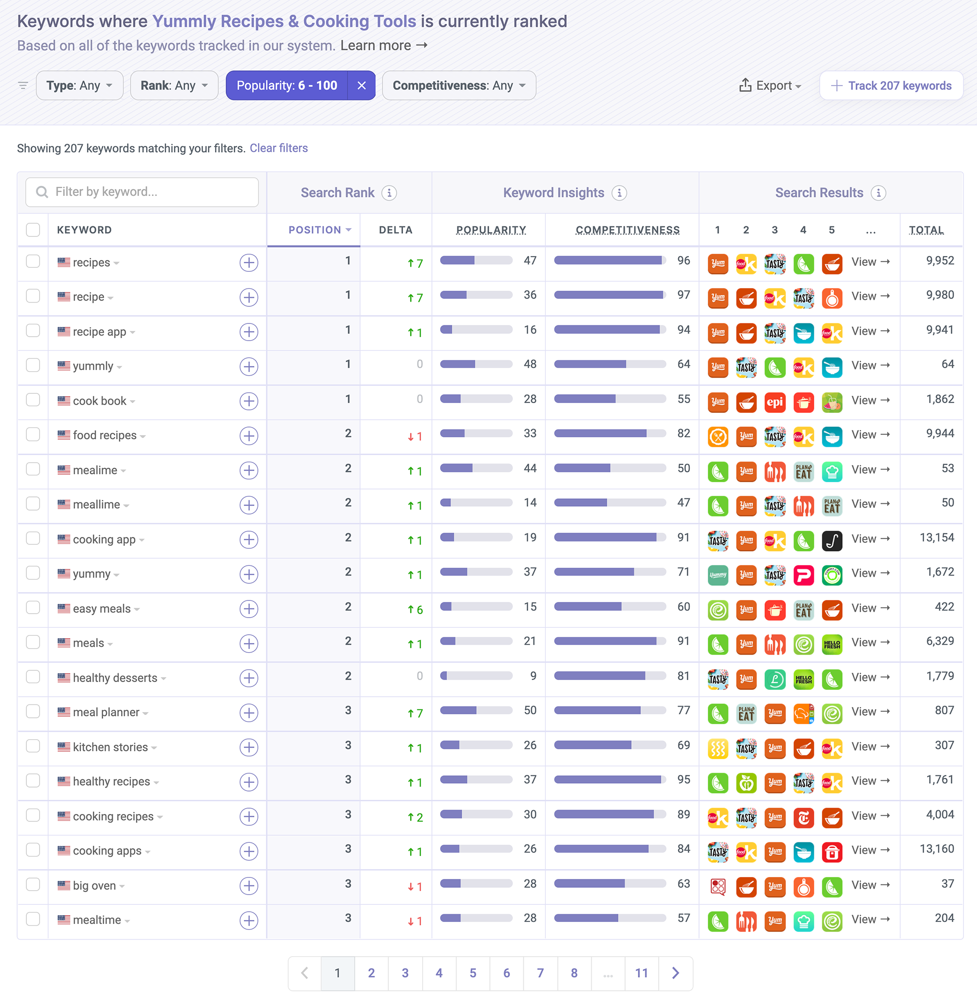
Let's have a look at where people are finding and downloading Yummly. Here are the keywords we've seen Yummly ranked in, sorted by rank, and filtered by popularity:

Right off the bat we can see Yummly really owns one important keyword and that's recipes. That's a really good one to have because it combines well with other keywords and opens up the door to many relevant combinations. If... the rest of the keywords are useful.
Curious which keywords your app ranks in? Check out the Discover Keywords report to find out.
Keyword Analysis - The Obvious Parts
Let's dig in by looking at the keywords Yummly is targeting in its name and subtitle. Those two send the strongest signals to the App Store's algorithm.
- Name: Yummly Recipes & Cooking Tools
- Subtitle: Personalized Meal Plans & More
The Essentials (5 of 5)
- Keywords aren't duplicated
- Using more than 20 characters in the name
- Using more than 20 characters in the subtitle
- Most popular keywords first
- Keywords combine to create more search terms
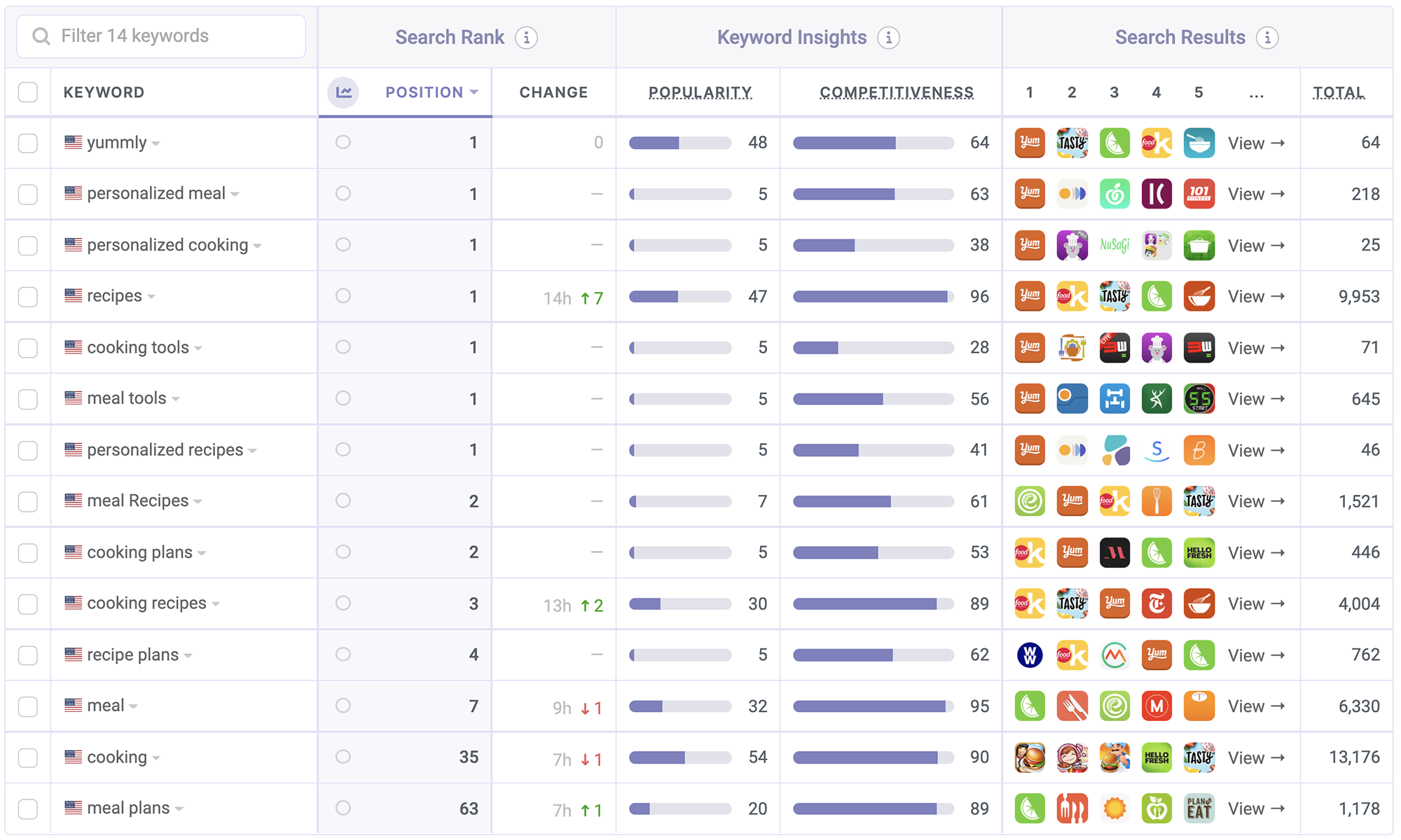
Strictly based on these, here are the popular keywords the algorithm sees:
- yummly
- recipes
- recipe plans
- cooking
- cooking recipes
- cooking tools
- cooking plans
- personalized recipes
- personalized cooking
- personalized meal
- meal
- meal recipes
- meal tools
- meal plans
At first glance, the name and subtitle look keyword rich and very good for ASO. But, when you take a closer look, you see many of those keywords aren't all that useful. Let's look at ranks and popularities and then talk about why this is happening.

Gut over data. That's my guess for why this is happening.
By "this" I mean keywords that have no value. In this case, it's "tools" and "more".
I scanned every keyword that includes "tools" and none had a popularity score that's not in the low single digits. Combine that with it sounding irrelevant, and boom, we just wasted five characters of the most precious of characters for no good reason.
Another one is "more". People don't normally look for things that include "more" in them, and as I looked at the keywords that include "more" in them, I couldn't find any worthy of its placement. Now, it's all the way at the end of the subtitle, the least precious of spots, but it's still in the subtitle, and that's just wasteful.
Other than those two obvious sins, there's "personalized", a word that's fairly hard to type so it's not something you should expect people to type into the App Store's search box. Sure, you may think Apple's autocomplete will take care of it, but that's putting faith in too many things. I wouldn't bank on it. Not as the first word of my subtitle.
The bottom line. These keywords don't sound terrible, seem worthy, and feel optimized. Unless you look at the data that shows they're not. To me that means someone either ignored the data, didn't look in the first place, or has outdated data. None of these options is great...
The real reason Yummly is ahead of competitors like Tasty, which has significantly more downloads, is that Tasty doesn't have "recipes" in its name but only its subtitle. That subtle change by Buzzfeed will overthrow Yummly. Probably within a few hours.
What's in the Keyword List?
Now, let's reverse-engineer the keyword list. The list isn't public, but we can attempt to uncover it by looking at all other keywords the app is ranked in. We believe it looks something like the following:
vegan,planner,breakfast,food,healthy,gluten,free,nutrition,dinner,vegetarian,planning,idea,cook,book
Yummly has been around since 2013, so the algorithm has seen quite a few keywords for it. That makes it a bit harder to tell what's in Yummly's keyword list right now, but I think we got pretty close here.
This isn't a bad list. Following the analysis of the name, I expected worse, but we see here what's now becoming a fairly common pattern of using related words that widen coverage.
In this case, we see:
- Types of food you can make.
healthy,vegetarian,gluten free - Types of meals.
breakfast,dinner - Words related to food.
nutrition,cook book,planner
These combine with the name and subtitle to produce a bunch of great combinations such as meal plan, healthy recipes, recipe book, and quite a few others. It's this list that turned our score from a B to a B+. It would have gotten an A-, but then we analyzed the screenshots...
👉 ASO Techniques: How to Optimize Your Keywords List in App Store Connect
Screenshot & Video Analysis
Much like the name and subtitle, on the surface, these screenshots check the boxes. There's no video in sight, which seems like an obvious miss considering how visual an app about food can be, but at this point, we're par for the course, so I'll just skip over it...

The Essentials (3 of 5)
- Using 7 or more screenshots
- There's enough contrast
- At least 80% of screenshots have captions
- Captions are easy to read
- Asking for the download
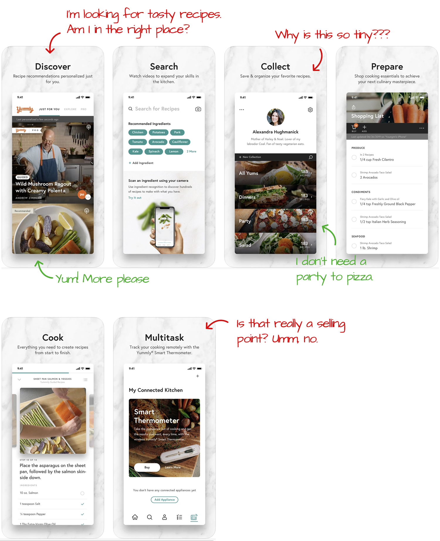
Yummly's screenshots check the usual boxes. They're captioned, have contrast, and show off features of the app that users could want. Three years ago, this would have been okay. But today, competing isn't just about having an average set of screenshots.
Here's what I would do to optimize these screenshots, so they turn more page views into downloads, starting with the most important:
- Sell benefits and not features. These captions do their job, but there's very little enticing or exciting about them. I don't want to discover recipes, I want to make delicious food. I don't want to collect recipes either. I want a list of my favorite finds. See what I'm doing here?
- Create more contrast. The marble background makes anything that's light, such as the app's UI, not stand out. It also makes text not that easy to read. A solid and darker background, say orange, would do wonders here.
- Ask for the download. I don't see this often enough, and it's such a missed opportunity. If a viewer gets to the last screenshot, it means they took the time to find the app, look it over, and scroll through screenshots. They're interested. All you need to do is ask.
What Data is Yummly Collecting?
In this new(ish) section, we look at the privacy labels apps declare on the App Store.
Data Linked to You:
- Contact Info
- Identifiers
- Location
- Purchases
- Search History
- Usage Data
- User Content
Data Not Linked to You:
- Diagnostics
I don't expect a recipe app to track me, and indeed, Yummly does not seem to be doing any sort of tracking. That's pretty refreshing! While they do collect data about users, it's fairly limited, and I can reason each of these items even without being a user of the app.
In fact, I analyzed a few of Yummly's competitors, and even they don't seem to be doing any sort of heavy tracking. Have we finally stumbled into an area of the App Store that isn't as ad-powered? Or, do recipe readers look more closely at privacy labels?
If I had to guess, I wouldn't go with the latter.
A Quick Look Under the Hood
Here are all the SDKs and APIs we see powering Yummly:
3rd Party + Open Source Projects:
- AppAuth Authentication
- AWS Cognito Authentication
- AWS SDK Utilities
- Branch Metrics Attribution · Deep Linking
- Facebook Login Authentication
- Firebase Messaging Notifications
- Google Sign-In Authentication
- Iterable Engagement
- Kingfisher Utilities
- Lottie Utilities
- Mixpanel Analytics
- ReactiveX Utilities
- Zendesk Communication
Native APIs:
- Apple Authentication Authentication · Apple APIs
- Apple Local Authentication Security · Apple APIs
- Core Spotlight Utilities · Apple APIs
- CoreLocation Location · Apple APIs
- HealthKit Utilities · Apple APIs
- MapKit Apple APIs · Mapping
- StoreKit Apple APIs · Utilities
- Swift Development · Apple APIs
Are you also looking for App Tracking Transparency? Well, no tracking really means no tracking. Interest!
There is a lot going in here, though, even without tracking. Most of it seems to be relevant and useful, though.
Mixpanel is a dead giveaway that Yummly is user-focused. It's too expensive to go unused. Zendesk, for customer support, isn't seen often but has a pretty wide footprint according to our SDK rankings. The rest are fairly recognizable, and we've seen in past teardowns.
I'd give this one a clean bill of health.
The Verdict: Less Guessing = More Downloads
Optimizing by gut is something I see all too often, and also why some developers believe ASO "doesn't work". If you're serious about getting more downloads organically, your first stop should be keyword popularity.
Can you guess your way to glory? Maybe? Possibly? Not really.
So, don't guess and use the data. Follow the numbers and use your creativity to put popular keywords together.
The Tools I Use
I did this entire analysis with our ASO tools and App Intelligence, the same ones hundreds of thousands of app makers rely on to monitor and optimize their apps. Check out some of my live session videos to see how I do it.

