ASO Teardown - 3 Suggestions for Spark Mail to 5x Downloads
Welcome to App Teardowns, a series where we analyze the strategies apps and games use to gain visibility and downloads on the App Store and Google Play, their performance, and competition.

We normally analyze apps that are very popular and command the top of their categories, but in this App Teardown, we're going to focus instead on one of the apps I use most often, too many times a day to count, and one that has stiff competition on the App Store—Spark Mail.
Spark Mail is, as you may expect by the name, an email client. Its advantage is that it makes handling your inbox easier than just having a bunch of emails in a list. Spark connects to Gmail and other popular email services, and those also happen to be its biggest competitors.
Overall, Spark earns a C, and 3 actionable suggestions, which you'll find highlighted throughout the teardown.
In this guide:
- Spark by the Numbers
- Slow and Steady Wins the Race?
- Taking on Giants - The Competitive Landscape
- How is Spark Mail Found?
- Keyword Analysis - The Obvious Parts
- What's in the Keyword List?
- Screenshot & Video Analysis
- What's Spark Mail Collecting?
- A Quick Look Under the Hood
- The Verdict: Let's Do This!
- The Tools I Use
Spark by the Numbers
Here's how Spark is performing in the U.S. App Store, based on our Competitor Intelligence:
- 📈 13.6K estimated downloads in the last 30 days.
- #️⃣ 214 in the Productivity category.
- ⭐️ 91% of new ratings were positive in the last 30 days.
- 👋 Audience is young and leans male
- 🏅 Competitors include Gmail, Outlook, Yahoo, and... Apple
Grow Smarter, with Data.
Affordable tools for ASO, Competitive Intelligence, and Analytics.
Slow and Steady Wins the Race?

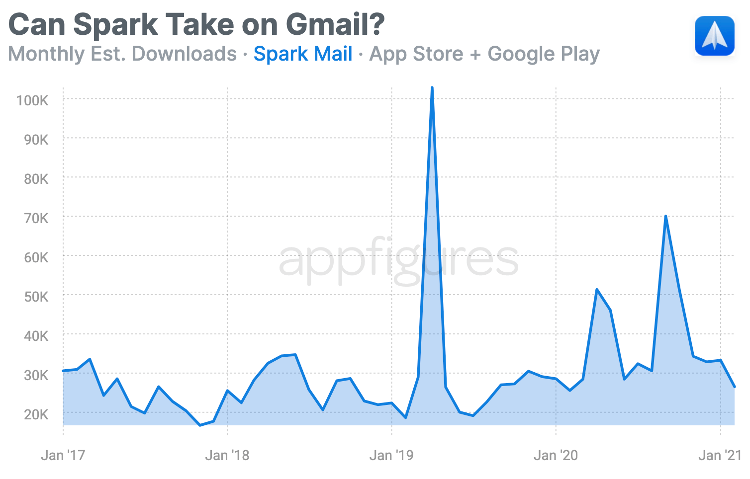
Spark has had pretty stable and consistent downloads over the last few years, with a few exceptions, such as the release of its long-awaited Android app.
Year over year, Spark's downloads have been growing at a (low) double-digit pace. Since 2017, yearly downloads have grown by 56%. Competing with Gmail, Outlook, and Yahoo (I know...) isn't easy, but Spark's stability means there's an opportunity here.
Taking on Giants - The Competitive Landscape

Spark is obviously the underdog in this race, but it's not a newcomer. That spells opportunity.
When I say opportunity, I don't mean Spark can make a few changes and dethrone Google. While it's possible to take over some keywords, it won't happen overnight. But that's not the only opportunity.
Google and outlook aren't only well-known brands, they also get downloads because their email services are bundled into a bunch of other things. Spark doesn't have that because it isn't a service but rather a client.
But!
Spark can be a client for all of them, so a download for Gmail can also end up being a download for Spark.
Competing with Google and Microsoft isn't the goal here. Instead, Spark can target the next app in the chain, which in this case is Edison. Take a look at those downloads, that's nearly 5x Spark's, and I suspect organic discovery has a lot to do with that.
As we get into the meat of this teardown you'll see why I say that and what Spark needs to do to take over.
How is Spark Mail Found?
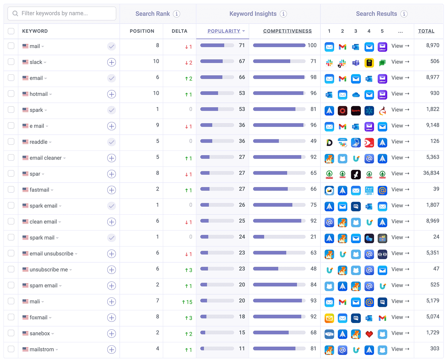
Let's start by zooming out to see which keywords contribute the most to Spark's downloads:

I don't see much that I'd call useful here, and as you'll see below, that's directly related to how unoptimized the app's name and subtitle are. In addition, it also means Readdle, the team behind Spark, doesn't make any changes to those areas often, so the algorithm doesn't have too many opportunities to learn more about the app.
Keyword Analysis - The Obvious Parts
Let's dig in by looking at the keywords Spark Mail is targeting in its name and subtitle:
- Name: Spark Mail - Email by Readdle
- Subtitle: Love your email again
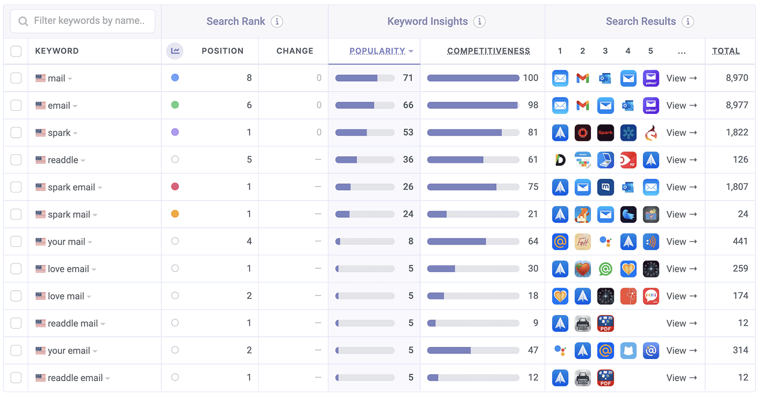
Strictly based on these, here are the popular keywords Apple sees:
- spark
- spark mail
- spark email
- readdle
- readdle mail
- readdle email
- love mail
- love email
- your mail
- your email
Hmmm... see anything interesting there? Exactly!

It might look like someone tried to optimize this name and subtitle combo, but if you look a bit closer, you'll see that's unlikely the case.
There are a few issues here, which start with the developer name taking up precious real estate for some reason and end with keyword duplication, dilution, and a lack of keyword variety.
Let's unpack these and see how they can be improved:
- Unless your developer name is hot, there's no real reason to mention it in the app's name. Apple automatically indexes your app for your official developer name, so repeating it in the name should only be reserved for cases where it's what people are looking for the most. I could be wrong here, but I doubt that's the case for Spark. Removing "by Readdle" would free up 10 whole characters!
- Duplication isn't helpful. Apple drops repeated words. By not repeating the word "email" we can free up 5 characters.
- Speaking of characters, the subtitle is only 21 characters long, while Apple gives you 30. There are 9 characters that can be used here.
- The most important keyword, email, is the 3rd word in the name instead of being the first. Keyword placement is important in the name, and while for less competitive keywords, apps can get away with not caring about position, when you're up against Apple and Google, position is important.
Suggestion #1 - The name and subtitle
To make things simple, I'll turn these into direct suggestions:
- Gmail can pull off having "Google" in its name, but Spark shouldn't just copy. Instead, "email" should be the first keyword in the name and subtitle should focus on things that combine well with email (like, organization) or extend it (like, calendar).
- As-is, the subtitle isn't helpful to ranks because it has no important keywords, nor humans, who wants to "love" email? Vague statements are only good in theory. Real people prefer actionable things.
If I had to phrase them, they'd look something like:
- Name: Email - Spark Mail
- Subtitle: Smart, Fast & Secure Inbox
Together, these two will help put Spark in front of Apple's algorithm more clearly. It may take some time to see movement for the main keyword, email, but all the other new keywords should see better positions pretty fast. Spark certainly has the ratings to support fast changes.
What's in the Keyword List?
Now, let's reverse-engineer the keyword list. The list isn't public, but we can attempt to uncover it by looking at all other keywords the app is ranked in.
🤷🏻♂️
This one was hard. Nay. Impossible.
Normally, this analysis involves looking at hundreds if not thousands of keywords and removing ones that aren't likely in the keyword list, this time, the starting list was not even a hundred keywords long.
That's, obviously, not great. But it means that there's a lot of unused potential here.
There could be a few reasons why this list is so "invisible". The first is that it might be extremely focused. So focused that it helps focus Spark on keywords like email and nothing else. The second, is that it just isn't there or doesn't contain enough keywords.
Including spaces, pluralizations, and wrapping multiple words with quotes are common issues I see app developers make. These mistakes are super wasteful and can really hurt the app's chances of ranking.
👉 ASO Techniques: How to Optimize Your Keywords List in App Store Connect
Suggestion #2 - Amplify your keyword coverage
The keyword list is a great place to throw keywords into that may not be as important as the ones in the name and subtitle, but work with those to create combinations that are relevant.
If I had to pick those for Spark, I'd consider the following:
calendar,organize,fast,inbox,address,message,contact,widgets,imap,schedule,filter,delegate,smart
There are a few in here that are probably going to end up duds and some that are obviously useful. That's a good mix to start experimenting with.
Screenshot & Video Analysis
Video shmideo... I'll rephrase. No video = missed opportunity. We don't see too many videos on the App Store these days, which means apps that do have one really stand out.
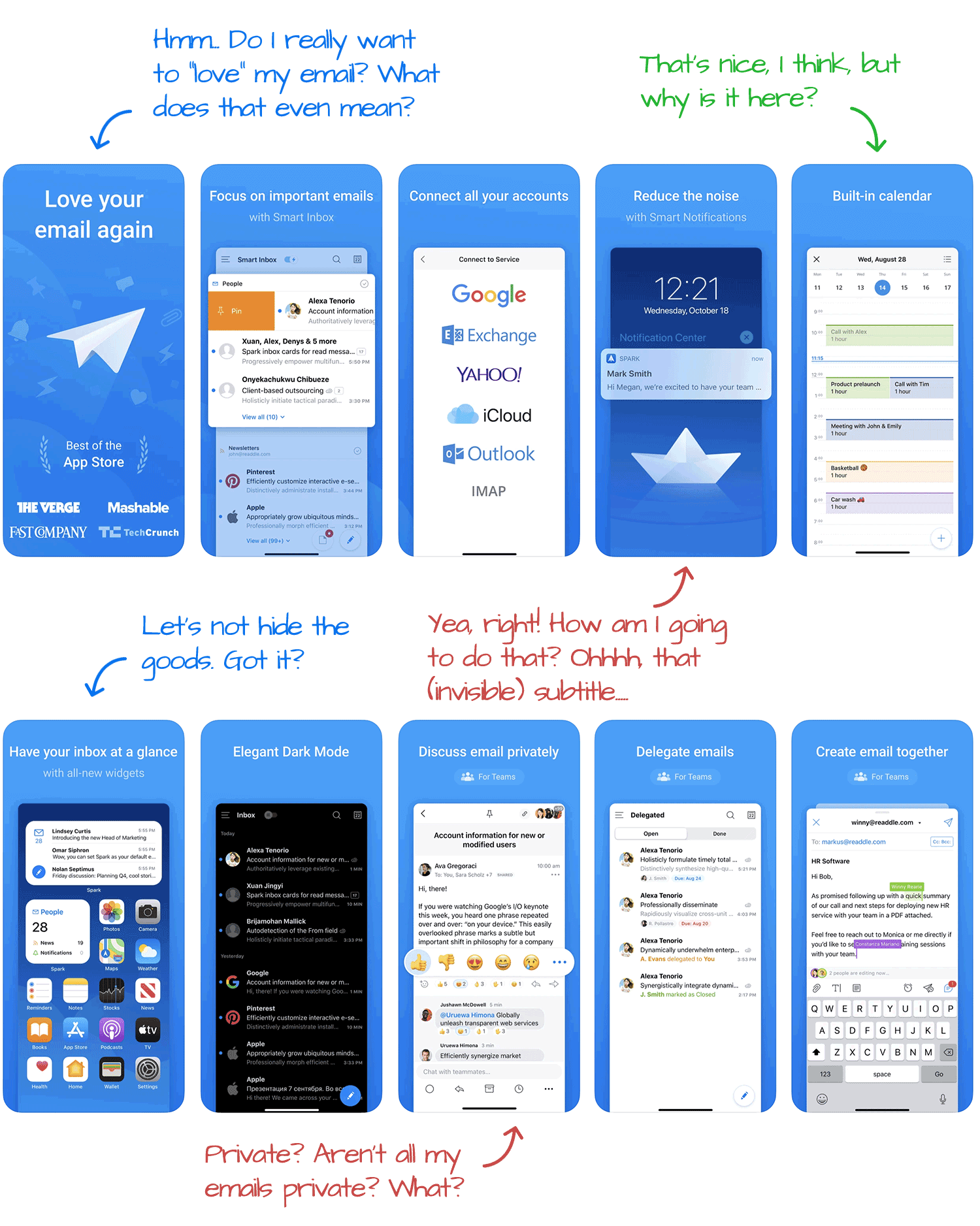
The screenshots aren't too bad at first (and even second) glance:

I do love the look and feel. They're captioned, there's a good amount of contrast, so those captions are readable, and all 10 possible screenshot slots have a screenshot. Those are all wins.
But...
Suggestion #3 - Tell your story
- Stick to actionable and stay away from vague statements. "Love your email" is a great mission statement, but when someone it looking at your app for just a few seconds, it doesn't do enough to really explain why this app is better than the rest. So, the first screenshot should instead, focus on highlighting the top benefits. Is it speed? the clean interface, the ability to snooze emails? Whatever it is, it should go in the first screenshot.
- The rest of the screenshots don't flow like a story, just short statements. It could work to convert, but has a lower chance. A smart move would be to go from showing the most popular/important features to the least, but still unique.
- Integrating humans into the screenshots makes them more friendly and reduces the friction of download. There are a few opportunities, like in the screenshot showing the list of emails (where there is one, but it's very small). Another option that's less inline is to humanize an entire screenshot like what we saw in TurboTax's App Teardown.
What's Spark Mail Collecting?
In this (somewhat) new section, we look at the privacy labels apps declare on the App Store. At that, Spark Mail collects the bare minimum:
Linked to You:
- Contact Info
- User Content
- Identifiers
Not Linked to You:
- Usage Data
- Diagnostic
Seems pretty fair, and to see non-personal usage means Readdle is using the usage data as a means for understanding how the app is used and not to target specific behaviors.
These can all be backed by looking at the SDKs and APIs Spark uses, which we do below.
A Quick Look Under the Hood
Spark's as clean as a whistle!
I don't come across many apps that don't use many 3rd party SDKs, but that is the case for Spark.
Here are all the SDKs and APIs we see powering Spark:
3rd Party + Open Source Projects:
- 1Password
- App Center Crashes
- AppAuth
- Bolts
- Starscream
Native APIs:
- Apple Local Authentication
- Apple Pay
- Apple Watch Connectivity
- Core Spotlight
- Core Location
- MapKit
- Passkit
- StoreKit
No known trackers or attribution services, and Spark is native with Swift.
Don't see a lot of those these days.
The Verdict: Let's Do This!
I really love to see (and use) apps that someone worked hard to make great, and that's how I feel about Spark.
Spark's edge is that it already has pretty significant traction, usage, and new downloads and ratings. Combined, all of these mean that spending a little bit of time on keyword optimization will go a long way towards putting Spark in front of an even bigger audience.
Is your app in a similar situation? Now you know what to do.
The Tools I Use
I did this entire analysis with our App Store Optimization and Competitor Intelligence tools, the same ones hundreds of thousands of app makers rely on to monitor and optimize their apps. Get ahead + outsmart your competitors with Appfigures. Get started →
Download and revenue figures used in this teardown are based on estimates extracted from our Competitor Intelligence tools.

