Season 3 Recap - Highlights From 13 App Teardowns
Welcome to ASO Teardowns, a series where we dissect the strategies apps use to gain visibility on the App Store and Google Play for you to learn from. This is a special edition.

Season three of App Teardowns wrapped up last week, and with one of the most popular Teardowns to date. This season we got to look at apps and games across a variety of categories, focusing on big names that make common mistakes. Like the previous two, this season is full of hands-on learning.
🎓 Check out all ASO Teardowns, or go back to Season One or Season Two.
In this guide:
- Season Three Stats
- 1. Amazon Prime (C+): How to Kill Conversion
- 2. Bumble (A-): Constant Iterations
- 3. Robinhood (A-): The Right Keyword List is Golden
- 4. discovery+ (B-): The Importance of the Subtitle
- 5. Match 3D (C): Don't Neglect the Screenshots
- 6. The Weather Channel (A+): How Screenshots Should Be Done
- 7. CSR 2 (B): Paid UA Supports ASO
- 8. TurboTax (B+): How to Humanize Your App
- 9. Spark (C): You Can't Just Guess
- 10. Tubi (A-): Optimizing for Intent
- 11. Podcast App (B+): Keyword Repetition is Wasteful
- 12. Hinge (A-): Focusing Your Keywords
- 13. Coinbase (A+): The Reason Everything Should Combine
- The Thing About Privacy Labels
- One Thing You Can't Not Do
- Your Turn!
Season Three Stats
Every Teardown starts with stats, for context, and this summary is no different. Except, this time, the stats are about the Teardowns:
- #️⃣ Analyzed 11 apps and 2 games. Yup, that's an extra one for you.
- 🔬 Reviewed 58 competitors, in addition to the main apps.
- 🔎 Inspected a total of 11,716 keywords.
- 🎨 Analyzed 93 screenshots. The average was 7.
- 📺 Watched a total of 0 App Preview videos. That's right. None. 🤷🏻♂️
- 💬 Held 2 Live ASO Teardown Sessions and 1 Live ASO Q&A.
- 📬 Received 619 replies from readers with questions about ASO, including from the teams behind most of the Teardowns we did, including from some of the developers of these apps.
- 🏅 Overall, the average score was a B+. I went for more educational value this time around, which meant more mistakes.
Grow Your Downloads
Discover new keywords, monitor ranks, and learn from competitors.
Each one of the Teardowns packs a lot of learning in both the do this and the don't do that categories. For this summary, I pulled the one thing I felt was most useful out of each Teardown, and together, those give you a pretty comprehensive set of ways to improve your App Store Optimization.
1. Amazon Prime (C+): How to Kill Conversion
We opened the season with an app from one of my favorite categories—streaming apps. Amazon Prime Video is no Netflix but has been gaining momentum in both downloads and revenue.
When it comes to ASO, however, Amazon isn't doing a great job. It's actually worse. But in the negative, there's a great learning experience. Amazon shows us how to get lower conversion by having very confusing screenshots:
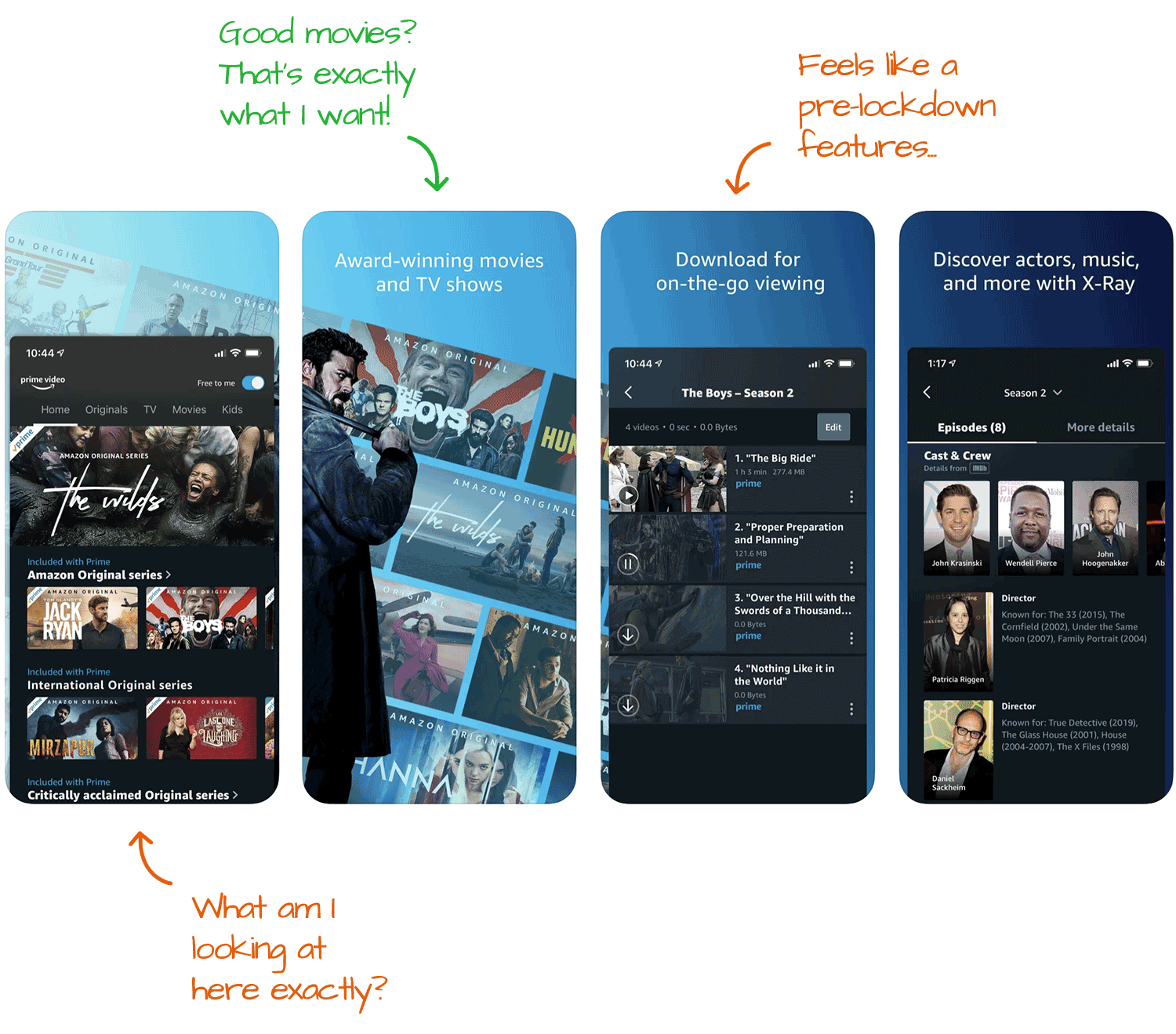
The right way to use screenshots is to tell a story, highlight the app's value, and push towards downloading. To do that, you need clarity and enough screenshots to tell a story. Amazon has neither.
With just four screenshots, the first without a caption, the screenshots are more likely hurting than helping.
Takeway: Follow best practices with your screenshots. If you're not sure what they are, check out this guide.
Read it: A Lot of Opportunities for Amazon Prime Video
2. Bumble (A-): Constant Iterations
We use ASO to get more visibility, and we do that by selecting keywords that people search for. Doing it once is good, but doing it over and over is how you'll get the most visibility.
That's what Bumble does to rank well in a lot of keywords. More than what the metadata can hold at one time.

The thing that Apple doesn't tell you, and it's true for Google too, is that the algorithm doesn't forget. So when you manage to convince it the app or game fits a specific keyword, it'll remember that association even after you change your metadata.
Sooooo, the more you iterate (aka. make changes), the more opportunities you'll have to rank for additional keywords.
FYI, the best frequency to make keyword changes is four weeks on the Apple side, and six weeks on the Google side.
Takeway: Don't be afraid to try new things. Worst case, they don't work, and you undo the changes. Best case, you continue to expand the number of keywords your app is ranked in.
Read it: Bumble's Gunning for Tinder
3. Robinhood (A-): The Right Keyword List is Golden
Robinhood is in a challenging market, where there are a few very obvious keywords they need to rank in and a loooooong tail of keywords that they should rank in.
The best way to amplify your keyword list is by choosing keywords that combine well with the ones you have in the app's name and subtitle and putting those into the longer keyword list.
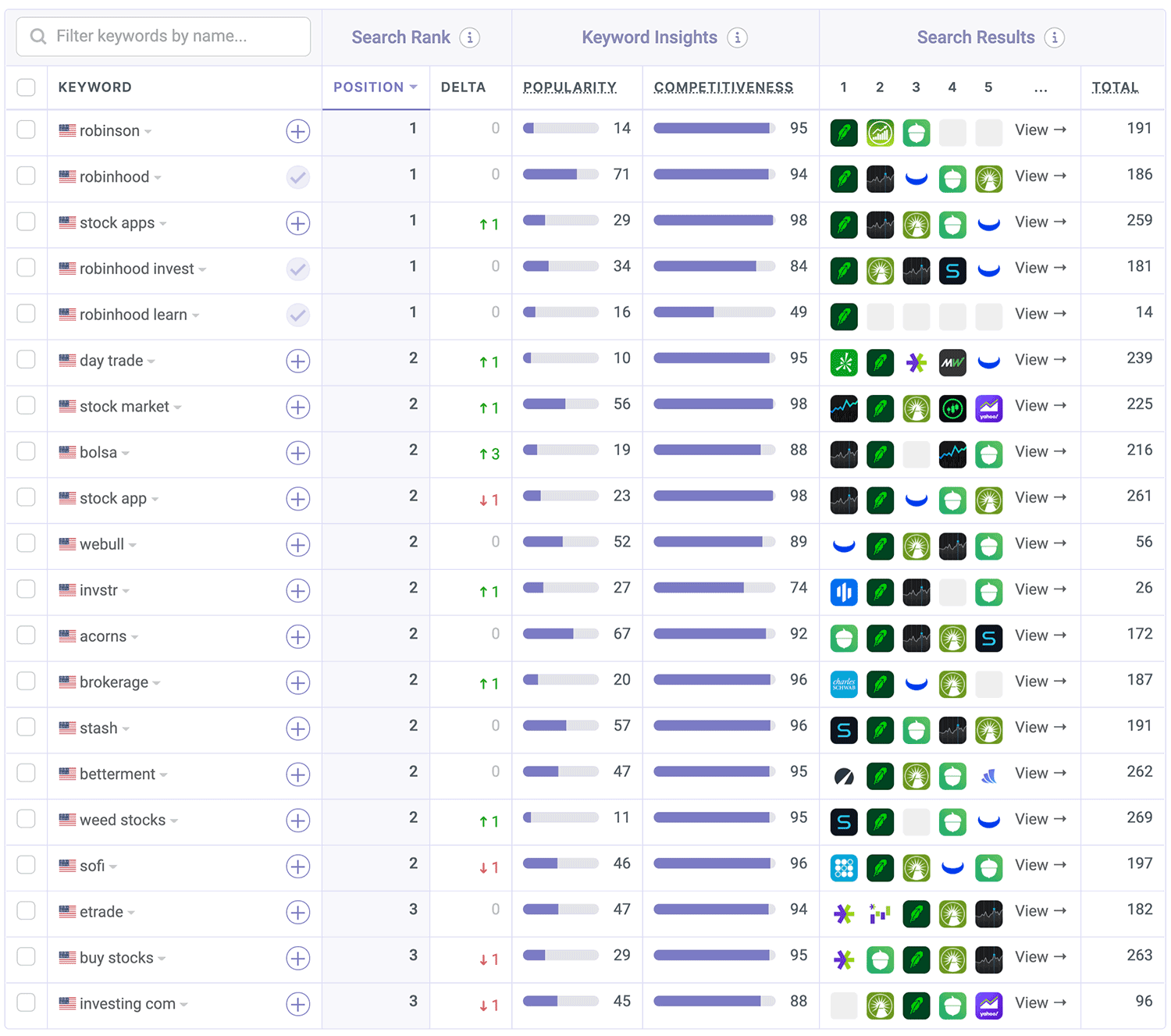
Robinhood's name and subtitle aren't amazing, but their keyword list is, and that makes a world of difference. It's the main reason why the app ranks in so many keywords, many more than what you'd expect just by looking at the app's name and subtitle.
The keyword list is the most neglected piece of metadata I've seen when working with developers, which is a big mistake. The good news is that optimizing your keyword list is pretty straightforward if you're using the right ASO tools.
Takeway: Optimize your keyword list. If you're not sure how check out this guide.
Read it: Robinhood is Almost There
4. discovery+ (B-): The Importance of the Subtitle
I looked at another streaming service this season, discovery+, which launched earlier in the year into a fairly crowded market, so having solid ASO would have been a great idea.
Unfortunately, that didn't happen.

I suspect the metadata was an afterthought that came together in the last minute when the developers realized what was needed to submit the app for review. It could also be a poor strategy...
- Name: discovery+ | Stream TV Shows
- Subtitle: Stream What You Love
The biggest problem discovery+ has, other than the lowercase d, is that its subtitle does nothing for ASO. The only useful word there is "stream" and that's already present in the app's name, so it's dropped.
"what" is a stop word, as is "you" and "love" doesn't combine well with any other keywords. Effectively, discovery+ wasted 30 characters and severely limited its ability to get discovered. Pub only somewhat intended.
Takeway: Choose keywords that combine well together and don't repeat them.
Read it: Discovery+ Starts Its Journey
5. Match 3D (C): Don't Neglect the Screenshots
Match 3D is a fun game that's well-optimized to convert free users into paying ones. But while it's doing that very well, it's leaving a lot of money on the table by not optimizing its app page for turning visitors into downloads.
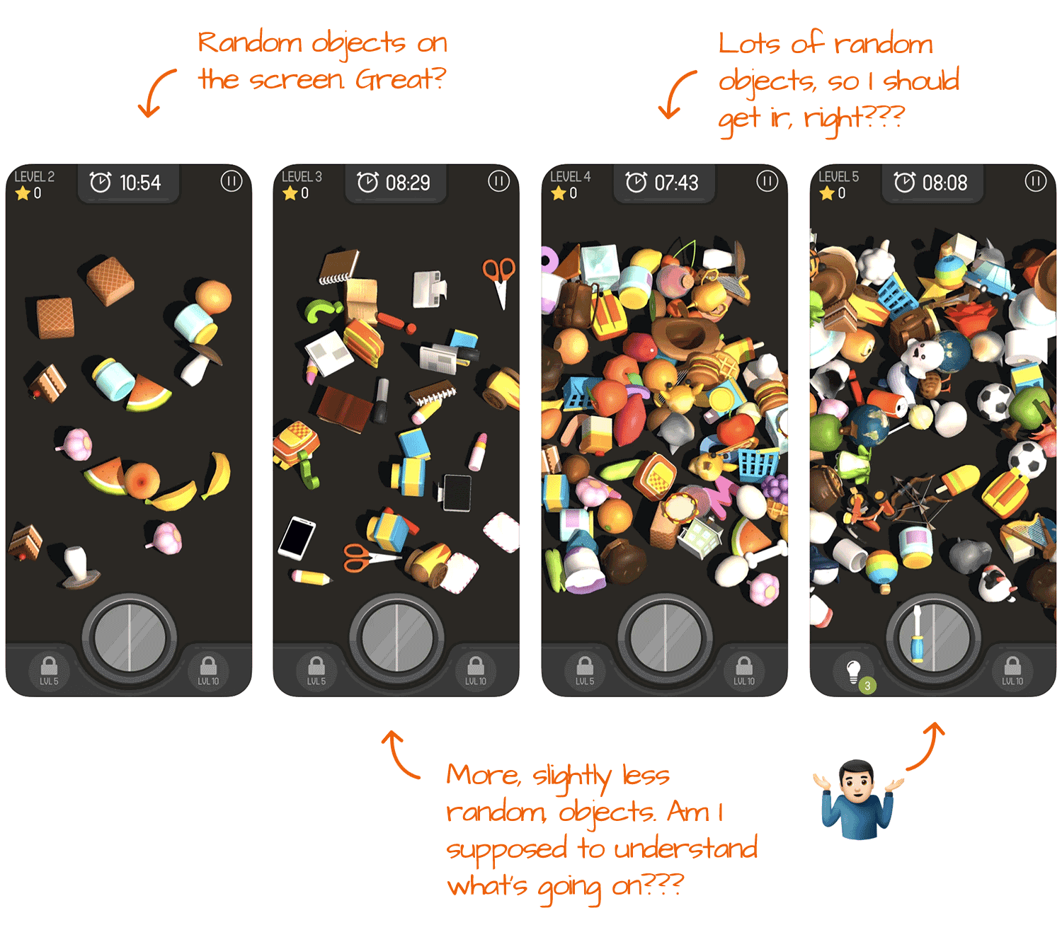
See what I mean...
Most users check out the screenshots of a game before downloading it because there are so many games out there that compete for a player's time that there's no reason to settle.
These look like an afterthought. Not captions, not showing anything interesting, and they're all pretty much the same. Please don't do that.
Takeway: Caption your screenshots to describe what it can do for the user.
Read it: Match 3D is Getting into ASO
6. The Weather Channel (A+): How Screenshots Should Be Done
The Weather Channel is doing a great job with their ASO, and for a company that wasn't born as an app, I find that pretty refreshing. Between a well-optimized set of keywords and screenshots that check all the boxes, there's a lot to take from this one, but my favorite has to be the screenshots.

First, The Weather Channel is taking advantage of all ten screenshots. Easy win that too many teams don't claim. Because they use all ten, they have the flexibility to get creative, which we can see with screenshots #3 and #10.
Showing off could be very powerful as long as you can back up your claims. In this case, every iPhone user who checked Apple's built-in weather app knows its weather data comes from The Weather Channel, so there's no reason not to believe it isn't the #1 app for weather.
The last screenshot is also very powerful, and we've only seen something similar once before (Todoist, in season 2). Screenshots are great for showing the value and telling a story, but they can (and should) also be used to direct action. In this case, it's very subtle. The word "join" as the last visual almost forces action. It's very well done.
Takeway: Use your screenshots to tell a story and drive action. Being aggressive is good as long as it's not too extreme.
Read it: The Weather Channel is #1 for a Reason!
7. CSR 2 (B): Paid UA Supports ASO
Games tend to spend more on user acquisition, aka paid ads, than apps, and CSR 2 is no exception. In fact, most of its downloads are a result of paid ads. On its own, this isn't an issue, but wouldn't it be better (and cheaper) if the game was also downloaded organically?
The thing is when you spend enough on ads, you can get pretty good organic ranks, but.
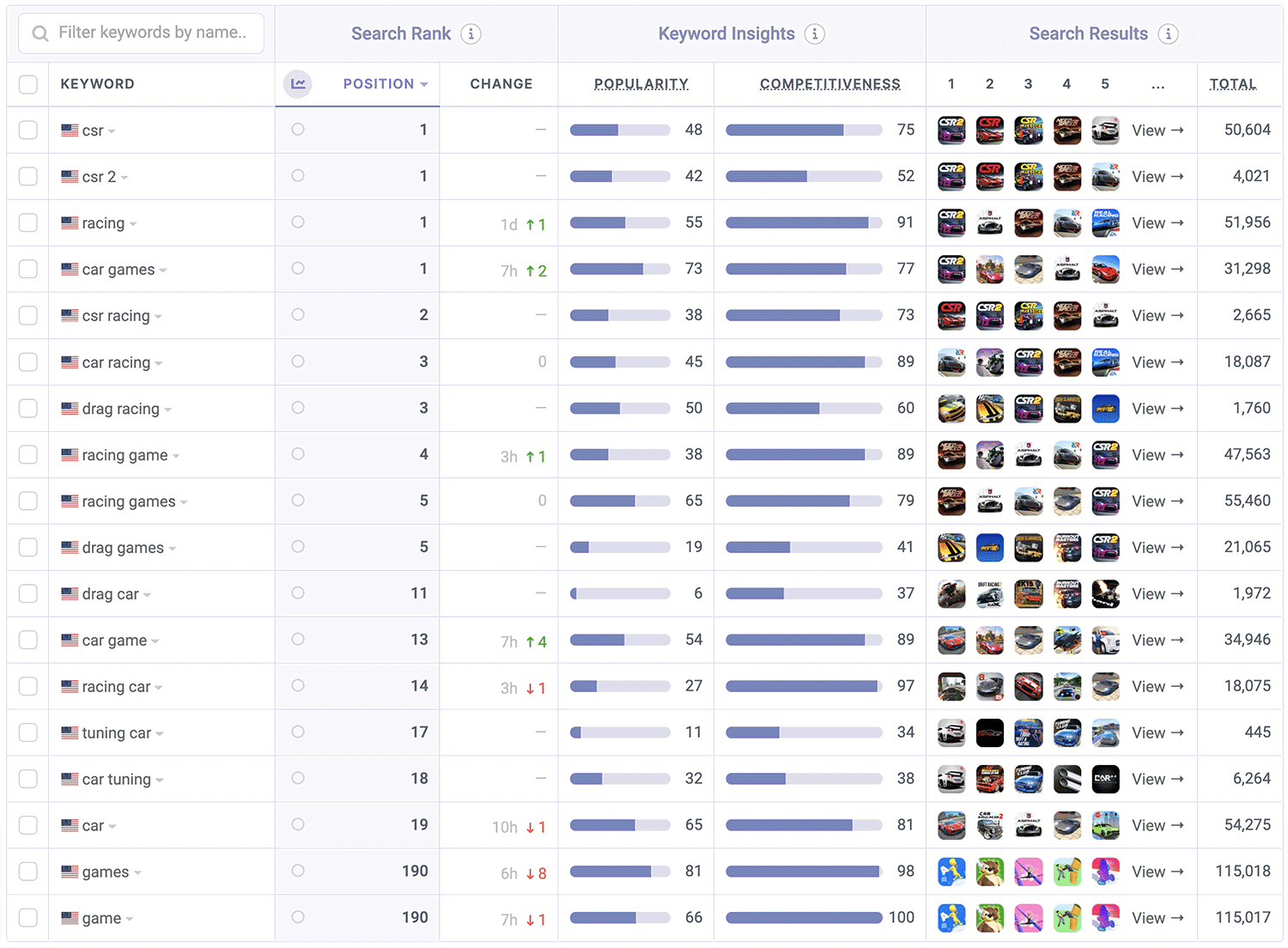
While you get the ranks, you still need to optimize your keywords, so you get the right ranks. Ranking in low popularity keywords might feel good but has no real impact on your bottom line.
Paid ads can offer a shortcut for ASO, as long as you look at it as a way to kickstart your organic growth, not replace it.
Takeway: Leverage paid ads, which guarantee traffic, as a way to kickstart your organic growth.
Read it: CSR Racing 2 Has Potential but Needs Maintenance
8. TurboTax (B+): How to Humanize Your App
TurboTax has a very short season, so any discovery, both organic and paid, has to be very optimized to get the most downloads. And they have a lot of time to experiment before and after tax season.
I believe that's why their screenshots look so polished.

There are a few good things to learn from here, but the one I find most important and not done enough, is the inclusion of a real human. Doing that immediately turns an app from something the user has no connection with into something they can more quickly relate to.
There are many ways to integrate humans into screenshots. TurboTax chose to include a full person, but including just a face, multiple people, or just a hand holding a phone are all good options you should experiment with.
Takeway: Integrate humans, whole body, face, or just hands, to increase downloads.
Read it: Why TurboTax isn't Getting to #1 with a Million Downloads
9. Spark (C): You Can't Just Guess
I love Spark. It's my email client of choice and overall, an app I can easily recommend to anyone. But, it makes a few mistakes on the App Store that cut its downloads by quite a bit.
The most egregious of errors, in my opinion, has to do with the lack of good keywords in its name and subtitle.
- Name: Spark Mail - Email by Readdle
- Subtitle: Love your email again
What the algorithm sees here is "spark", "mail", "email", "Readdle", "love", "again".
The repetition of "email" is ignored, "love" isn't really relevant here, and "readdle" isn't necessary because it's the developer's name, which the algorithm looks at as well.
So what we end up with is a very short list that's diluted by a whole bunch of not-so-useful words, and that's why Spark isn't ranking in keywords where it can.
There are two solutions here: 1. research more popular and relevant keywords or, 2. Remove all of the unnecessary words, so at least the important ones aren't diluted.
Takeway: Using keywords that sound good is a shortcut to failure. Check popularity and competitiveness before using a keyword in your metadata.
Read it: 3 Suggestions for Spark Mail to 5x Downloads
10. Tubi (A-): Optimizing for Intent
Another streamer, but I promise this is the last one for the season.
Tubi is an interesting app, and in my opinion, deserves more popularity. It's free and has pretty good content. Yup, I said free.
Analyzing it, I discovered it's got a pretty solid keyword list which I have to highlight.
movie,stream,reality,program,scifi,online,animated,channel,trailer,guide,popular,entertainment,kid
Keyword list optimization strategies vary from app to app, but the one Tubi is using here is one of my favorites. Tubi is optimizing for keywords that are built around what the user wants, directly. For example, a user may not look for "watch tv" but rather "reality tv" because they care about that specific type of show. Same goes for "animated movies", etc.
Takeway: Use keywords that describe the kinds of things people can do with your app or game, even if they're not features.
Read it: Tubi Owns Movies, but Can It Take on Netflix?
11. Podcast App (B+): Keyword Repetition is Wasteful
We recently got into podcasting which made me take a good look at podcast players, and The Podcast App seems to own the category so I dug a bit into it.
The Podcast App doesn't come with a more branded name but rather went for a very generic one. It's not a terrible idea because it allows it to focus its keywords.

And that focus helps it get ahead in search results. While I wouldn't normally suggest doing this, in this case it works. It makes talking about the app harder, so less word of mouth, but if ASO is the only target, this is a good strategy.
But... while that's good what's bad is that the subtitle practically uses the same words, eliminating it altogether from what the algorithm sees. That's wasteful.
Takeway: Don't repeat keywords between the app's name and subtitle. I can't say this enough.
Read it: A Look at the Most Downloaded Podcast Player
12. Hinge (A-): Focusing Your Keywords
HInge is a pretty popular dating app in the U.S., where dating as a category is less popular than the big brands. That doesn't mean ASO isn't important, and Hinge knows that
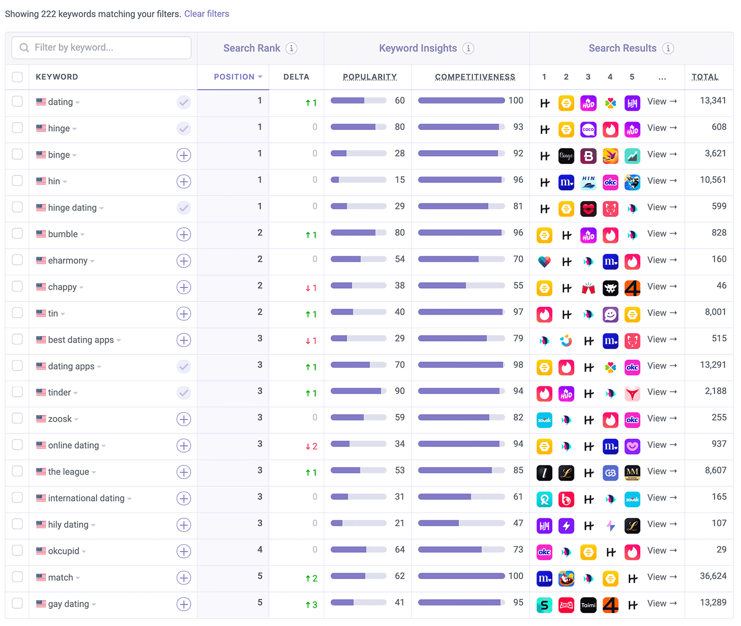
Instead to trying to rank in a wide number of keywords, Hinge is sticking to a few main one like "dating" by including it early in the app's name and repeating it in the keyword list.
This is a pretty specific strategy that makes sense here and in any other instance where it's better to be #1 for the most important keyword instead of top 5 for a bunch of less popular ones.
Takeway: In some cases, more keywords aren't better. When that's the case, limit the app's name and subtitle's length and select keywords that are very similar.
Read it: A Look at the Most Downloaded Podcast Player
13. Coinbase (A+): The Reason Everything Should Combine
Normally we have 12 Teardowns in a season, but Coinbase is doing such a great job that I didn't want to hold it until the next season. Really, Coinbase is an ASO machine, and considering the field it's in and what it's managed to achieve, I completely understand why.
There's a lot to learn from Coinbase, which is probably why it's the most popular Teardown so far in 2021, but since I had to pick a single highlight, it just has to be how all of the keywords in the app's name, subtitle, and keyword list combine beautifully.
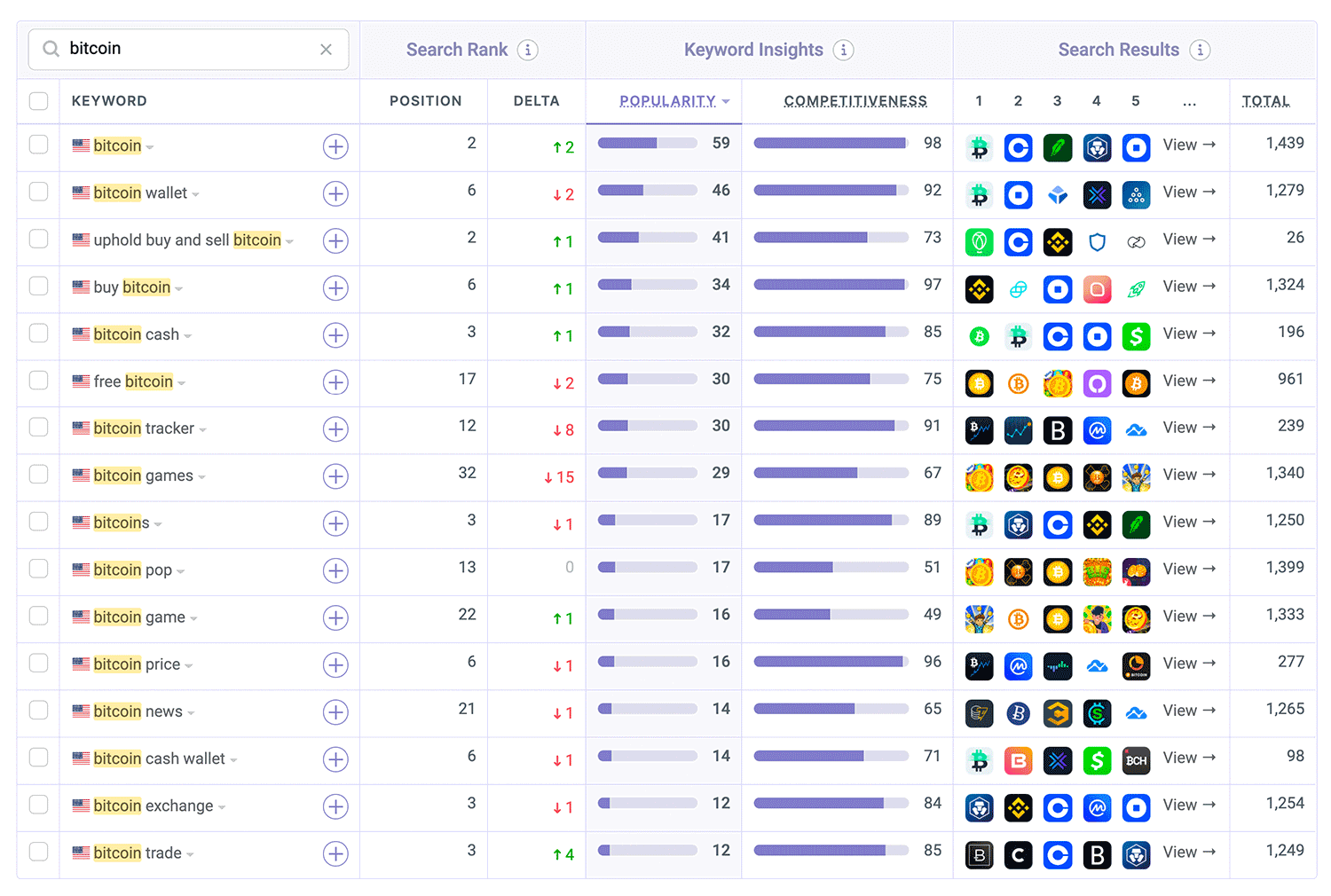
Coinbase discovered that many popular terms follow a format that includes the feature and a name of a cryptocurrency. A good example is: "buy bitcoin", "buy litecoin", and "buy etherium". They then took the keyword that's repeated most and placed it in the app's name while the actual currencies went into the keyword list.
Takeway: Look for patterns that will help you tackle more keywords by combining the app's name, subtitle, and keyword list.
Read it: Coinbase is an App Store Optimization Machine!
The Thing About Privacy Labels
I started looking at the privacy label of iOS apps this season because I believe that eventually, how apps use data will become a factor in whether a user gets the app or moves on to a competitor.
But the more apps I looked at, the more I realized that as they are right now, that won't be happening any time soon. The reason is that while it's nice to know what apps are collecting, it's hard to tell why they collect it.
I have a feeling the next iteration of labels from Apple will have to do with the how, at which point it could become important for conversion, and ASO.
I'm not sure when Apple will get to v2, but given how things are moving with ATT (App Tracking Transparency), I don't think it's a question of if, just when.
One Thing You Can't Not Do
Test, test, and then test some more.
One of the best ways to improve your ASO is to try new things. Whether you're getting ideas from competitors, your users, or ones you come up with, testing them for a short period before committing fully will help prevent stumbles.
This mindset will also help you move faster. When testing, always keep an eye on performance, specifically downloads, page views, and keyword ranks. When any of those moves in the wrong direction, move on to your next experiment or undo the changes.
Your Turn!
Now that you've read this recap (and hopefully the rest of the Teardowns), you have what you need to get your app in front of more users using ASO! All you need now are tools to make researching and monitoring easy, and we've got those!

